Arium · UX/UI Design · 3 months
Arium Tournament Redesign
Making competitive cloud gaming easier to join, follow, and scale.
Tournaments introduced a state-heavy experience into Arium: players needed to join at the right time, understand rules and rewards, follow match progress, access available streams, and interpret rankings as the competition changed. I contributed to turning that complexity into clearer flows, interface states, UI refinement, directional testing, and developer handoff documentation within a three-person design team.
Final desktop and mobile tournament direction, captured from the original Arium case study.
Project snapshot
Arium at a glance
A three-month tournament redesign across desktop and mobile, delivered within a three-person design team.
Product
Arium · B2C cloud gaming
Role
UX/UI Designer
Duration
3 months
Platforms
Desktop and mobile
Team
Three designers, including a design lead
Collaborators
Product, leadership, technical team, and developers
Scope
Tournament and tournament league experience
Tools
Figma and FigJam
Product context
Competition inside a cloud gaming platform
The tournament experience had to connect a player-facing journey with a system that changed by status and participation. Cloud access reduced hardware barriers; the interface still had to make competitive play understandable.
Product overview — What is Arium.
01
Player device
Use a device the player already owns.
02
Arium cloud platform
Run supported games without local installs.
03
Game session
Enter the game through the cloud experience.
04
Tournament layer
Join, follow, and interpret competitive play.
Why this was more than a UI refresh
A player moving through a tournament did not just need a page to browse. They needed to discover a competition, understand what was required, join at the appropriate time, follow match progress, and interpret how rankings worked. The interface also needed to respond as tournament status and player participation changed.
The design challenge
Reduce ambiguity without reducing competitive depth
The problem was not a lack of information. Players needed clearer actions, easier access to essential details, better match context, and ranking patterns that could support different tournament structures.
01 · Friction
Actions became difficult to interpret as tournament status or player participation changed.
Product implication — The interface needed to communicate the available action and its context together.
02 · Friction
Rules, rewards, schedules, and other key details were difficult to access.
Product implication — Important information needed to sit closer to the decision to join or follow.
03 · Friction
Schedules and results lacked direct access to match summaries and streams.
Product implication — Match rows needed to support both progress checking and available match content.
04 · Friction
Ranking views did not clearly support different tournament types.
Product implication — The ranking pattern needed to adapt without becoming a new design each time.
05 · Friction
Ranking tables provided limited information about other players.
Product implication — Competitor context needed to be more useful when interpreting standings.
My role and contribution
Clear ownership inside a collaborative design process
I worked as a UX/UI Designer alongside a design lead and another designer. The final direction was collaborative, but my role had a clear through-line: help structure the problem, test weak points, refine the UI, and document how the feature should behave.
My direct contribution
I proposed the UX checklist, assisted the Product Manager with flow refinement, created early feature structures and interactive prototypes, contributed to UI improvements, and proposed and created component-state handoff documentation.
Design team collaboration
The three-person design team collaborated on competitor review, workshops, prioritization, journey mapping, iteration, final UI, and design reviews.
Cross-functional collaboration
The Product Manager, Product Owner, CEO, technical team, developers, and stakeholders contributed requirements, constraints, feedback, and implementation review.
Finding the friction
Structure the journey before polishing screens
Competitor review and directional testing highlighted risks around action clarity, detail access, and ranking comprehension.
01
Discover
02
Review details
03
Join / status
04
Follow schedule
05
Open match
06
Interpret ranking
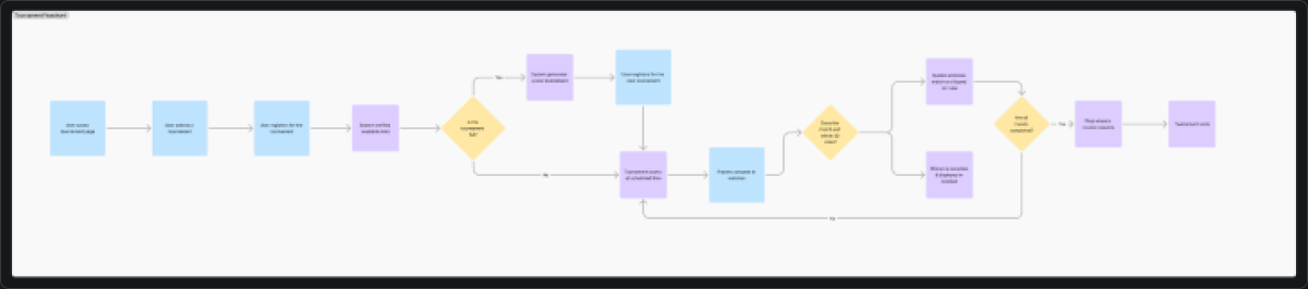
Original tournament flow from the Arium case study sources.
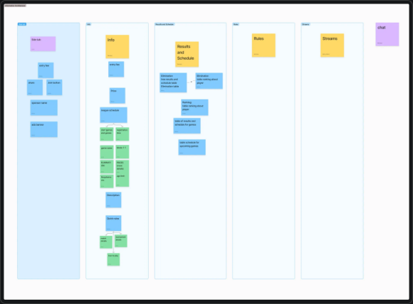
Feature organization used to structure the redesign work.
Directional testing
Issue → change loop
Directional prototype testing with gamer colleagues surfaced immediate confusion around actions, details, match context, and rankings — feeding the four final design decisions.
Exploration
From sticky notes to first tournament concepts
Early sketching and first interface passes shaped how the team approached tournament structure before the final direction.
Sticky note sketching
First sketch of the tournament
First design of tournament
First design of tournament — continued
UX checklist used for planning
Sketch to design
Design strategy
Reduce ambiguity, not functionality
Five principles kept the team focused on moments where players and developers needed clarity most.
Make the available action clear
Let action and supporting context respond to tournament status and participation.
Keep essential details close
Place rules, rewards, schedules, and tournament information near the decision to join or follow.
Make match progress easier to follow
Connect schedules and results with summaries and available stream access.
Support different competition structures
Use ranking patterns that can adapt across games and tournament formats.
Document behavior, not only appearance
Document component states, interactions, variations, and ranking behavior as carefully as final screens.
Final solution
Four moments where clarity mattered most
The final direction focused on four connected decisions in the tournament experience. The value described below is intended design value, not a measured behavioral outcome.
1. State-aware tournament actions
Evidence
Action buttons and supporting information became difficult to interpret when tournament conditions changed.
Design response
Design the CTA area so its action and supporting information respond to tournament condition and participation.
Intended value
Present the relevant action and context together, reducing how much a player has to infer.
Tournament CTA component variants
2. Tournament details inside the core experience
Evidence
Rules, rewards, schedules, and other key details were difficult to access.
Design response
Bring these details into the tournament feature and organize them with clearer information hierarchy.
Intended value
Place information needed to understand the competition closer to the decision to join or follow.
Made tournament info accessible
3. Match context inside schedules and results
Evidence
Players needed easier access to match summaries and available streams from schedules and results.
Design response
Expand match rows to include a game summary and a direct link to watch the match.
Intended value
Let the table support both checking tournament progress and moving into available match content.
Match info & stream links
Added match info & stream links
4. More adaptable and informative rankings
Evidence
Ranking views did not clearly support different tournament structures and provided limited player information.
Design response
Reorganize the ranking area to differentiate tournament structures and include more player detail.
Intended value
Provide more context for interpreting competition and a more flexible pattern for different games and formats.
Final connected tournament experience — desktop CTA variants and mobile.
Developer handoff
Document behavior, not only appearance
Static screens could not explain conditional tournament behavior. I proposed a documentation approach and created specifications that developers could review alongside the final UI.
Developer handoff walkthrough.
Component states
Show how interface elements respond as tournament status changes.
Interactions
Explain intended behavior beyond a static frame.
Tournament variations
Capture differences that affect the experience across conditions.
Ranking behavior
Document how ranking patterns adapt and display information.
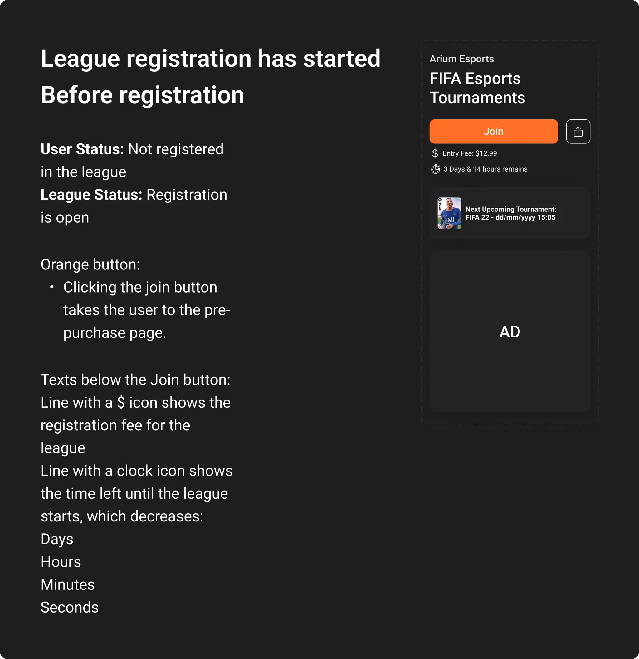
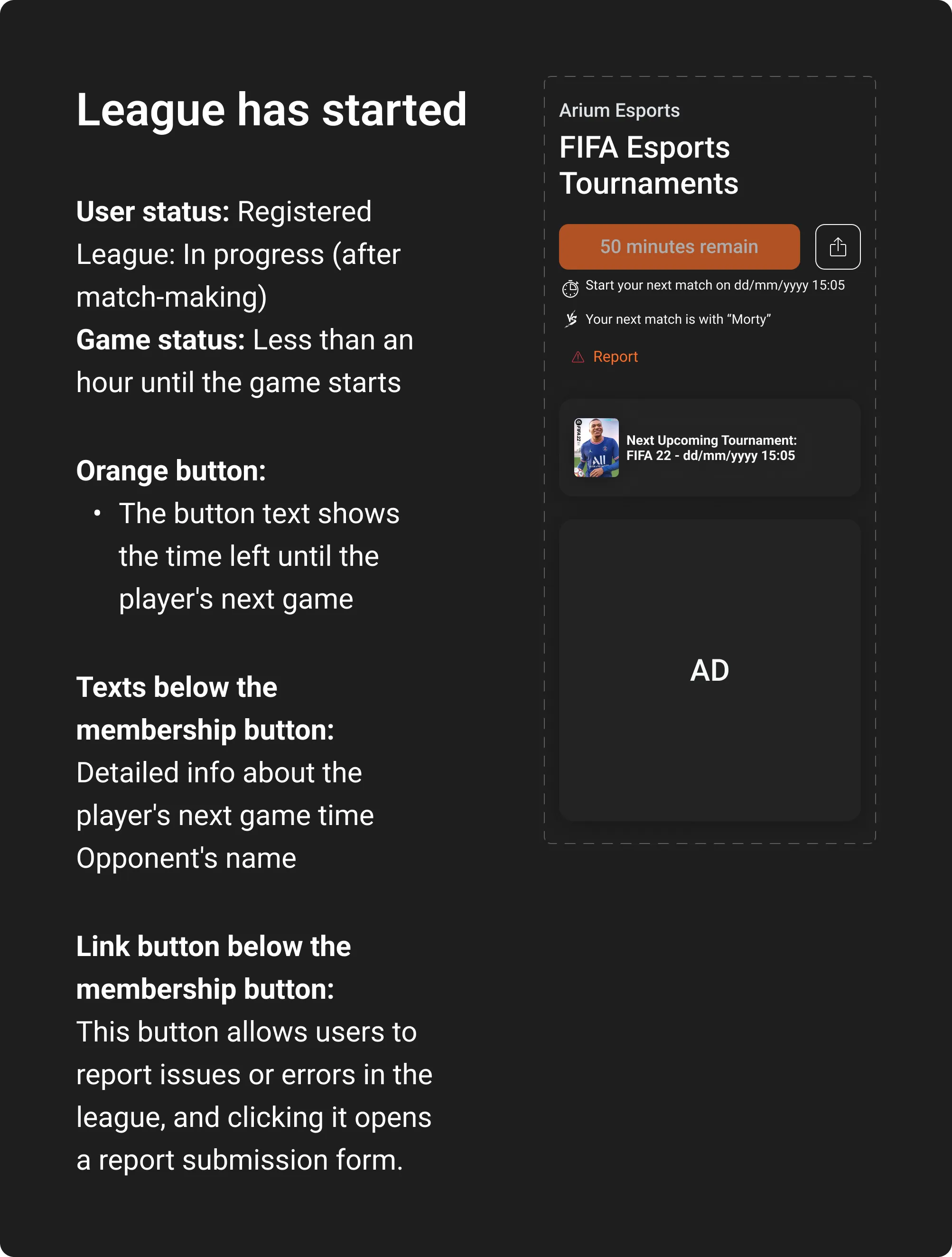
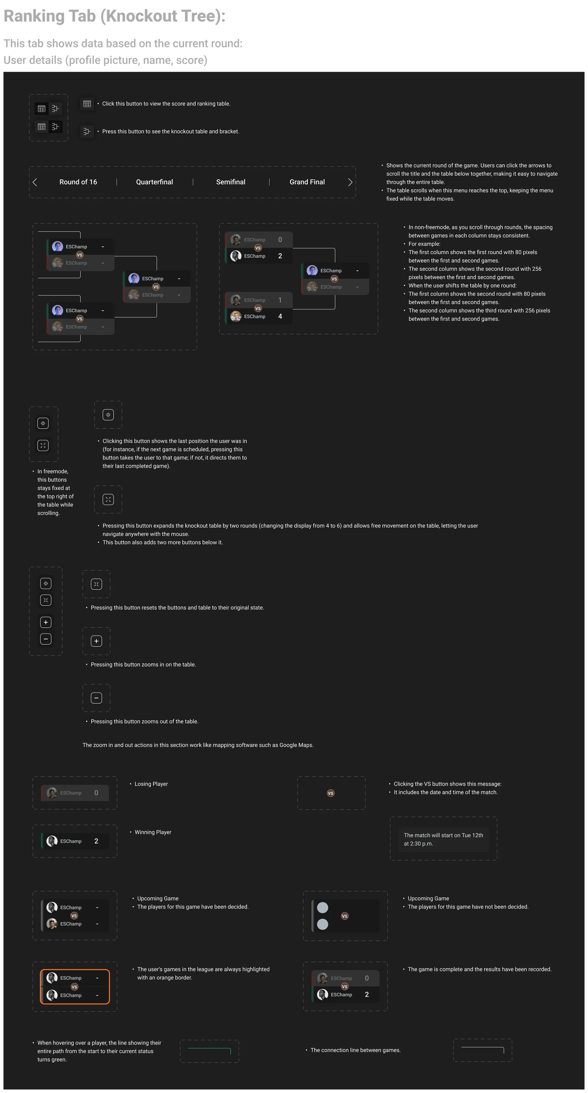
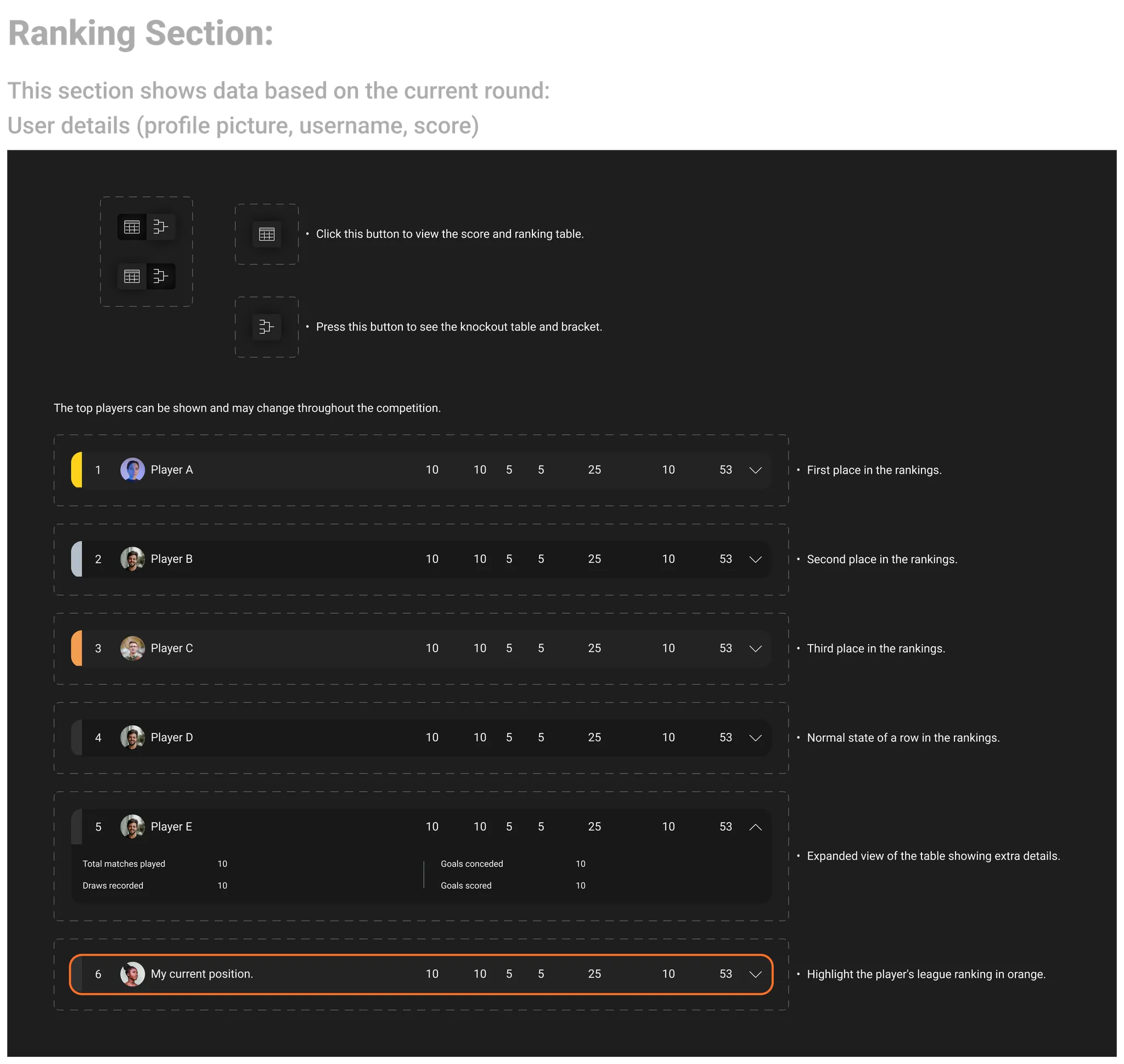
Source documentation from the original Arium case study. The evidence supports component states, interactions, variations, and ranking behavior; it does not prove implementation speed or reduced meeting time.
Design output, limits, and reflection
A stronger design direction, with evidence limits kept visible
The available sources support a qualitative design output rather than a quantified product outcome. No broad product growth figure is attributed to this redesign.
Design output
Connected actions to status and participation; moved rules, rewards, and schedules closer to the flow; added match context; created adaptable rankings; and documented behavior for implementation.
Validation limit
Directional testing with gamer colleagues identified immediate confusion, but the record does not confirm an external sample, task-success data, or tournament-specific post-launch measurement.
What I would measure next
Registration completion, abandonment by state, repeat participation, schedule and stream usage, and ranking comprehension with external players.
Reflection
Complex features need explicit state logic
This project reinforced that polished screens are only one part of product design. Complex features also need explicit state logic, information timed to the right moment, and documentation that gives design and engineering a shared model of how the experience should behave.