Making market research easier to create
47% less time to set up market research in a usability evaluation
As Product Designer, I redesigned BetaTrends’ creation flow to bring editing, preview and pricing together in one workspace, then refined it through two rounds of usability testing.
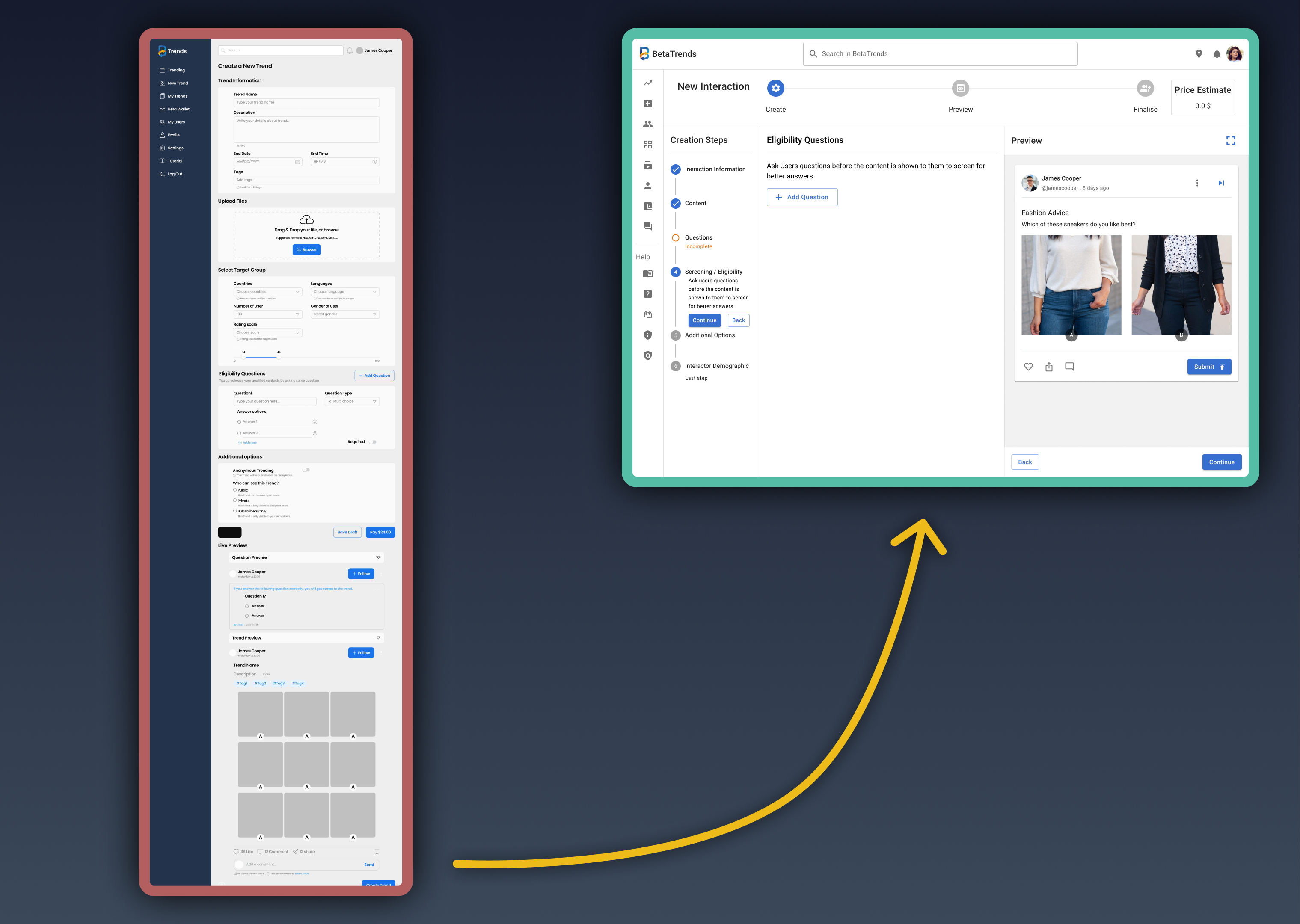
- Project
- BetaTrends New Interaction
- Role
- Product Designer
- Period
- 2023–2024
- Collaborator
- Pieter, founder and product owner
I was responsible for the creation-flow redesign, usability testing and design handoff.
I worked with Pieter, BetaTrends’ founder and product owner, and the design and development team. Pieter and I selected the structural direction together.
BetaTrends helped creators collect audience feedback on their products. To launch a research activity, they had to work through a long form and move between editing, preview and pricing.
Context: An early-stage market-research platform in Australia. The team needed a practical creation experience for a soft launch while the product and its shared design system were developing.
Watch the redesign evolution · 1 min 9 sec
See the inherited form, staged redesign, connected workspace and later interaction refinements in one continuous overview.
Turning audience feedback into product decisions
BetaTrends let creators ask an audience questions and receive reports of their responses. Each research activity was called an Interaction.
My work focused on setting up an Interaction: preparing content and questions, defining the audience, reviewing cost and checking the preview.
How an audience answers an Interaction · 23 sec
A long form with disconnected preview and pricing
Creators entered their research details in one long form, then opened separate windows to check the cost and preview. The flow gave them little guidance about where they were or what remained.
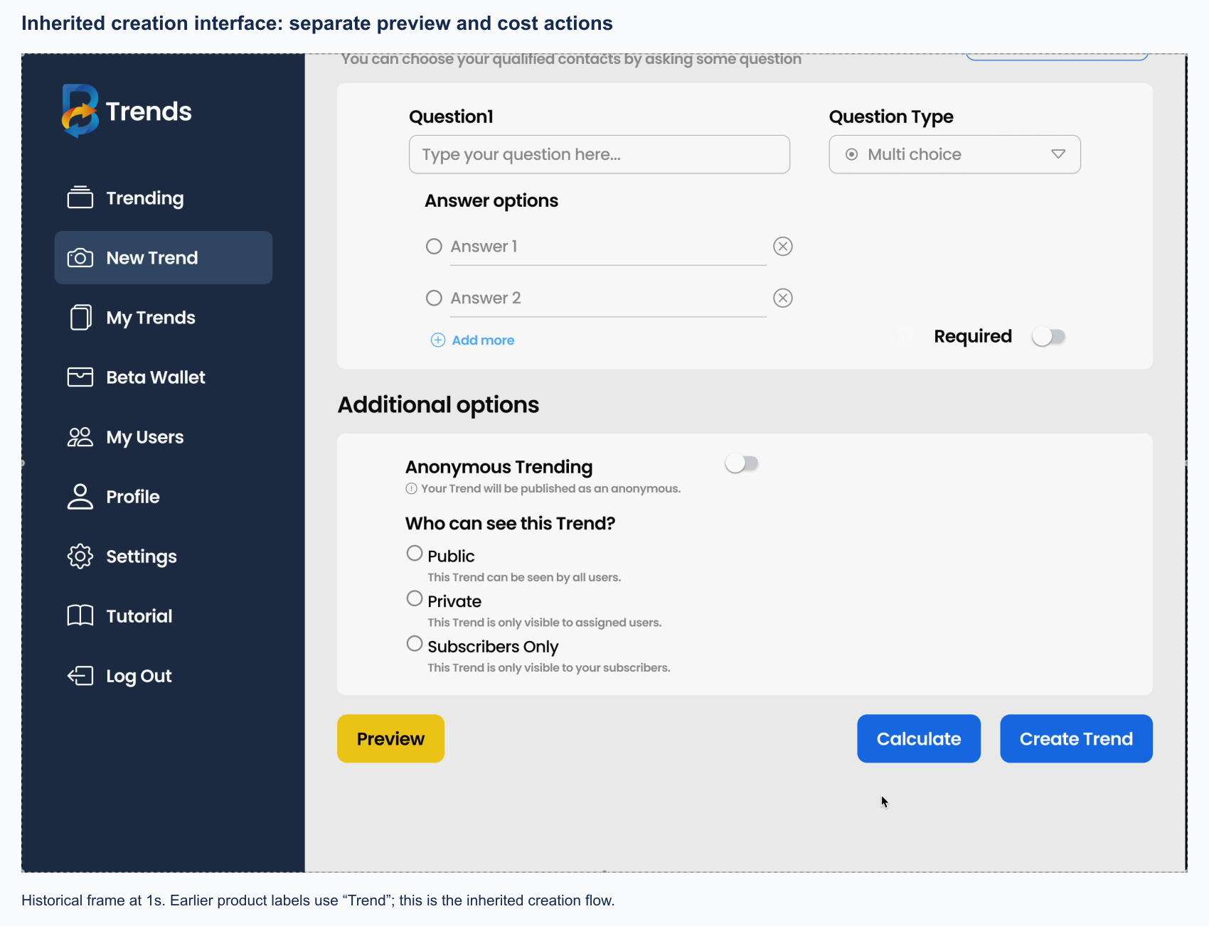
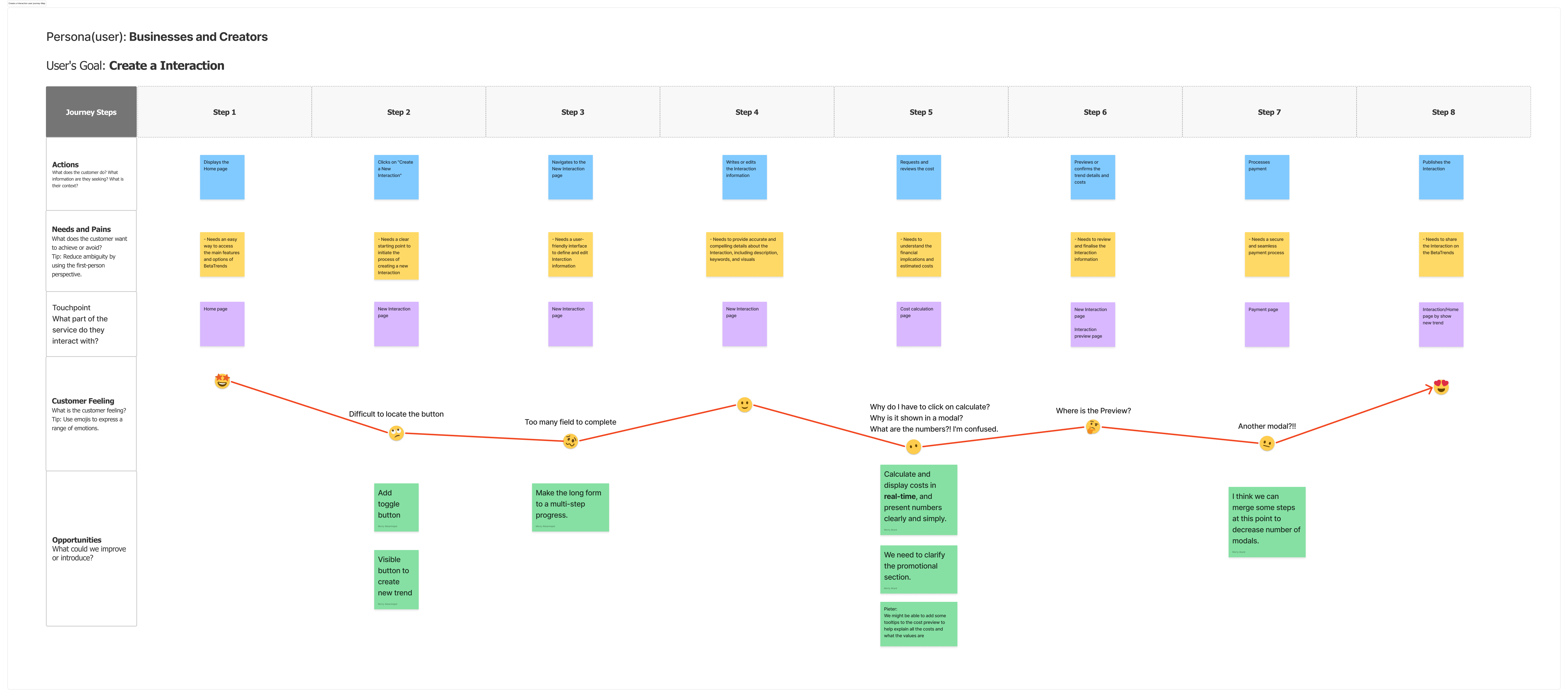
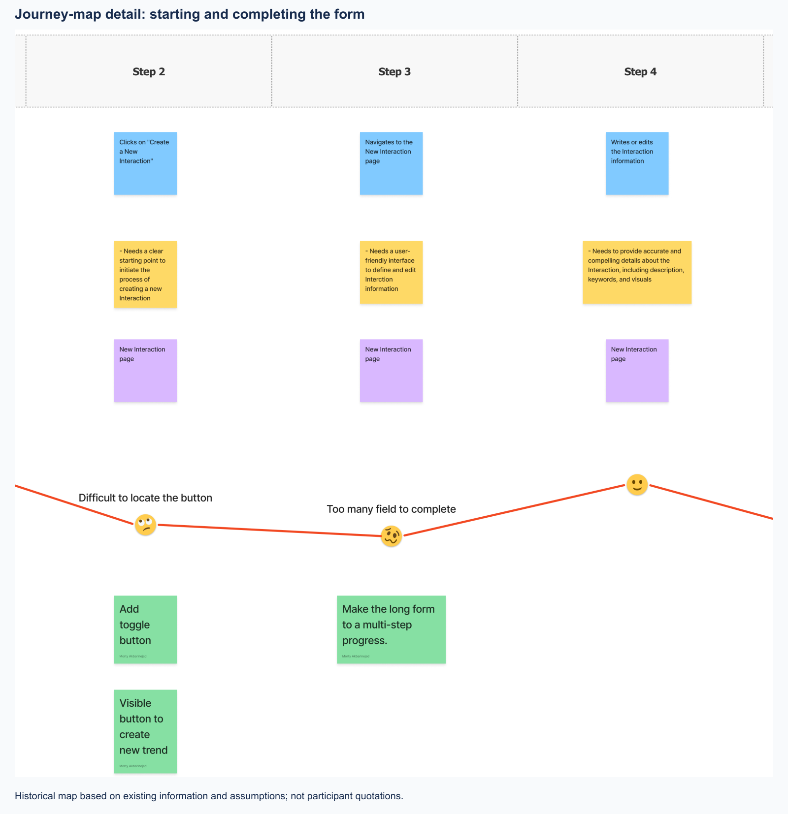
I mapped the journey using existing user information and assumptions to validate. This helped identify two priorities: make progress clearer and keep preview and pricing closer to the editing task.
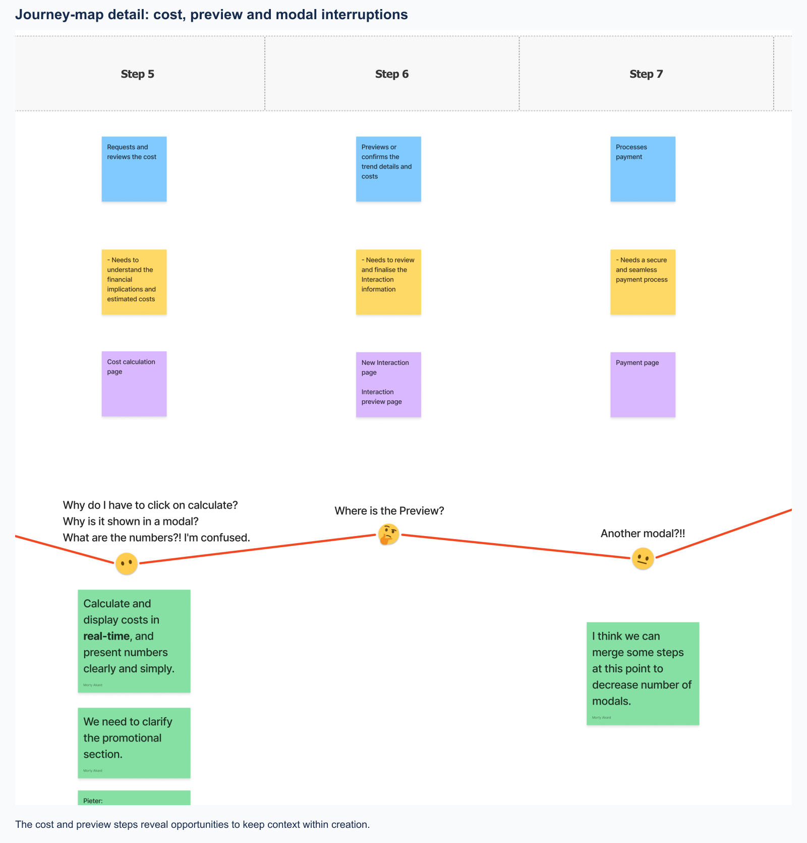
Explore the full journey map and starting-point detail
Breaking the long form into steps before the soft launch
With the soft launch approaching, we needed a practical first redesign. I discussed the setup problems with Pieter and the team, then reorganised the form into stages with visible progress and Back/Continue navigation.
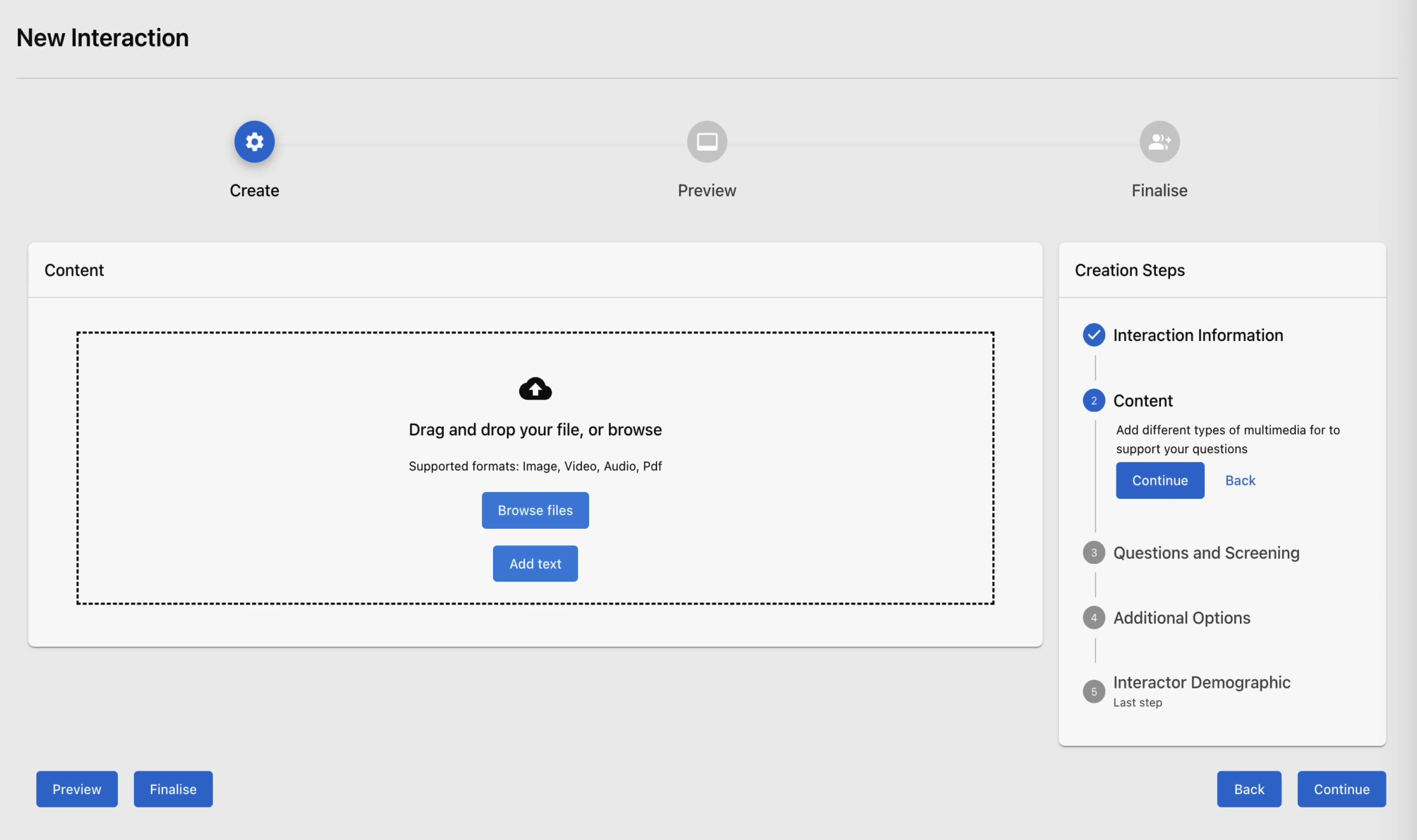
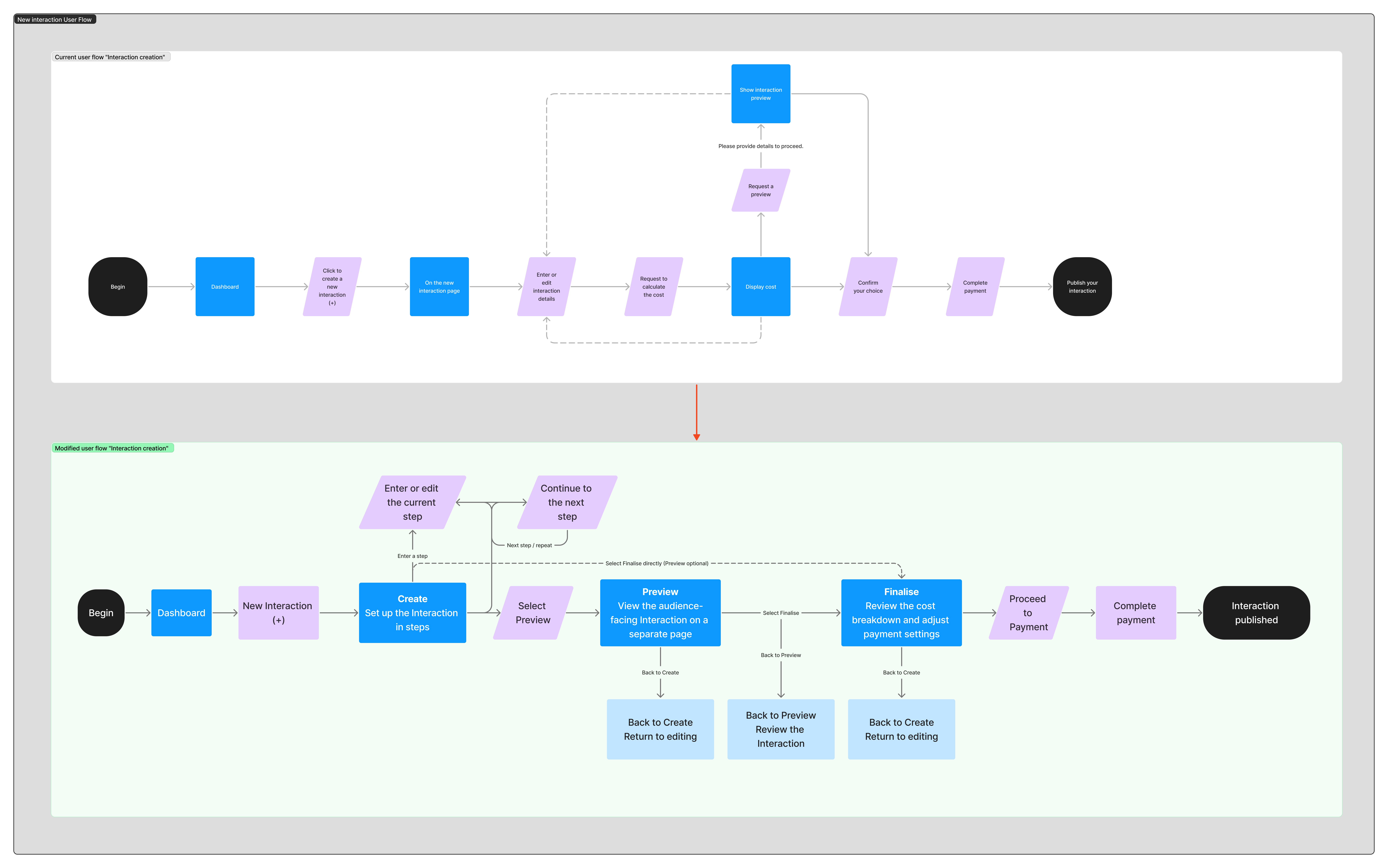
Diagram retrospectively corrected to match the original design walkthrough.
We also wanted creators to see how their choices affected cost. To fit the launch schedule, we placed the price estimate at Finalise and deferred live pricing during creation.
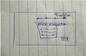
View the early sketches and staged-flow walkthrough
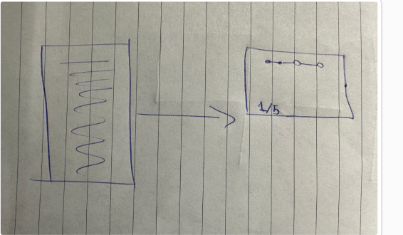
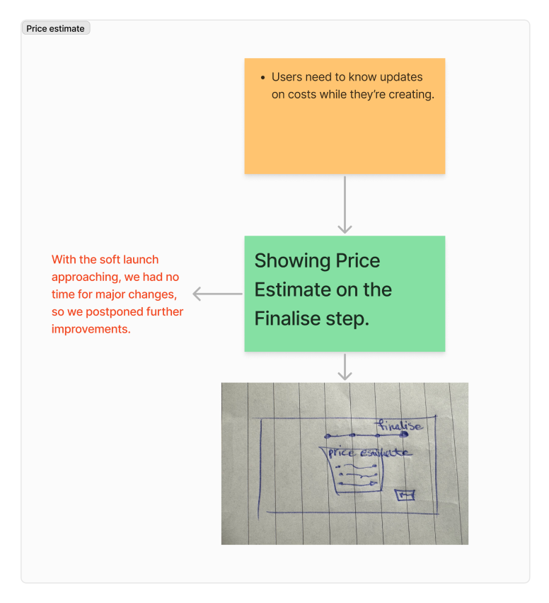
Watch the initial staged redesign · 38 sec
Notice the creation-step navigator and how preview and finalisation remain separate phases.
The staged flow made the sequence visible, but checking preview and pricing still meant leaving the editing task.
Visible steps did not solve the loss of context
Before the soft launch, I recommended reviewing product usage through Hotjar. After the limited launch, I reviewed recordings and analysed user and customer feedback with the team.
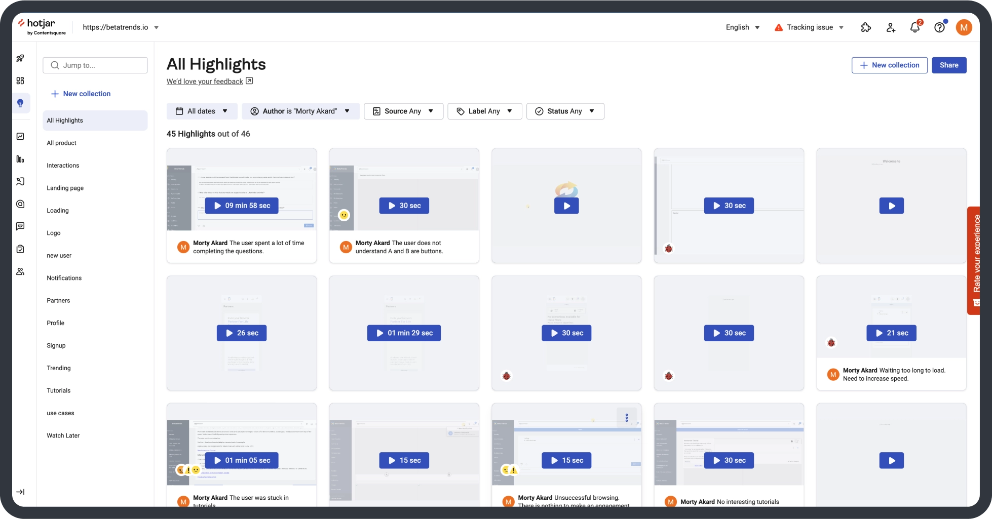
The findings pointed to three needs: seeing the audience-facing preview while creating, understanding how choices affected cost, and distinguishing research questions from eligibility questions.

I grouped the findings around effort, clarity and continuity, then discussed them with Pieter and the team and facilitated workshops to explore another structure.
The next design needed to keep steps, editing, preview and estimated cost together.
Bringing editing, preview and pricing into one workspace
I explored comparable products and developed three layouts that combined editing, preview and pricing. Pieter and I chose the layout shown below, considering familiar navigation, clear progress, working space and feedback from our workshops. We accepted a denser layout to keep progress, editing, preview and pricing visible together.
Selected direction
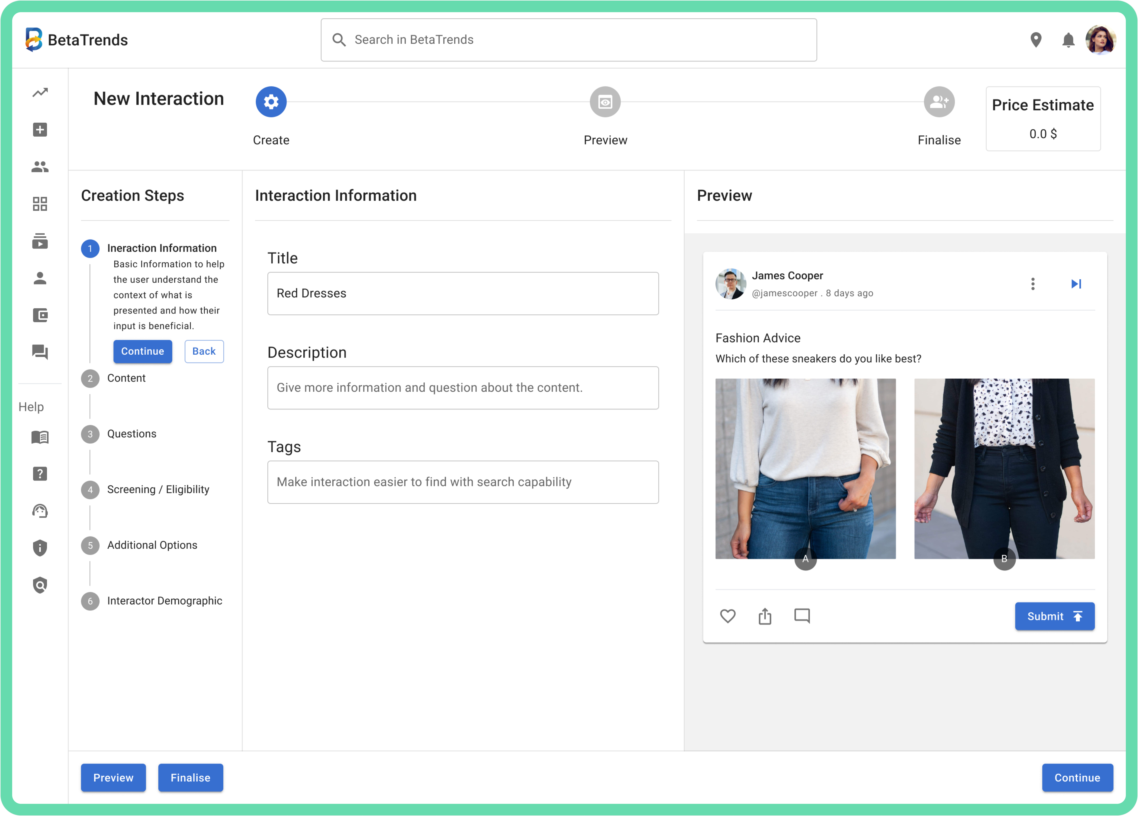
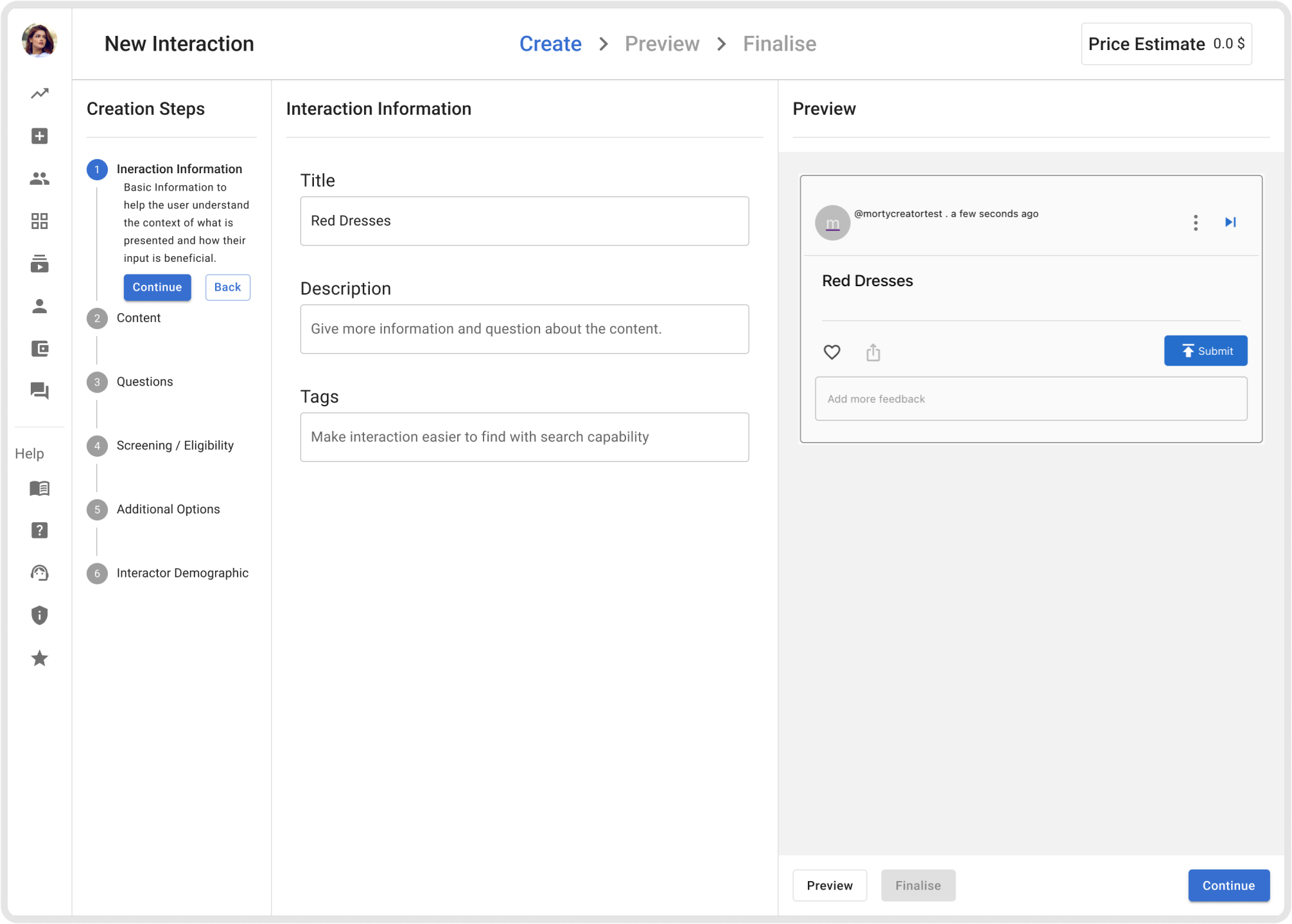
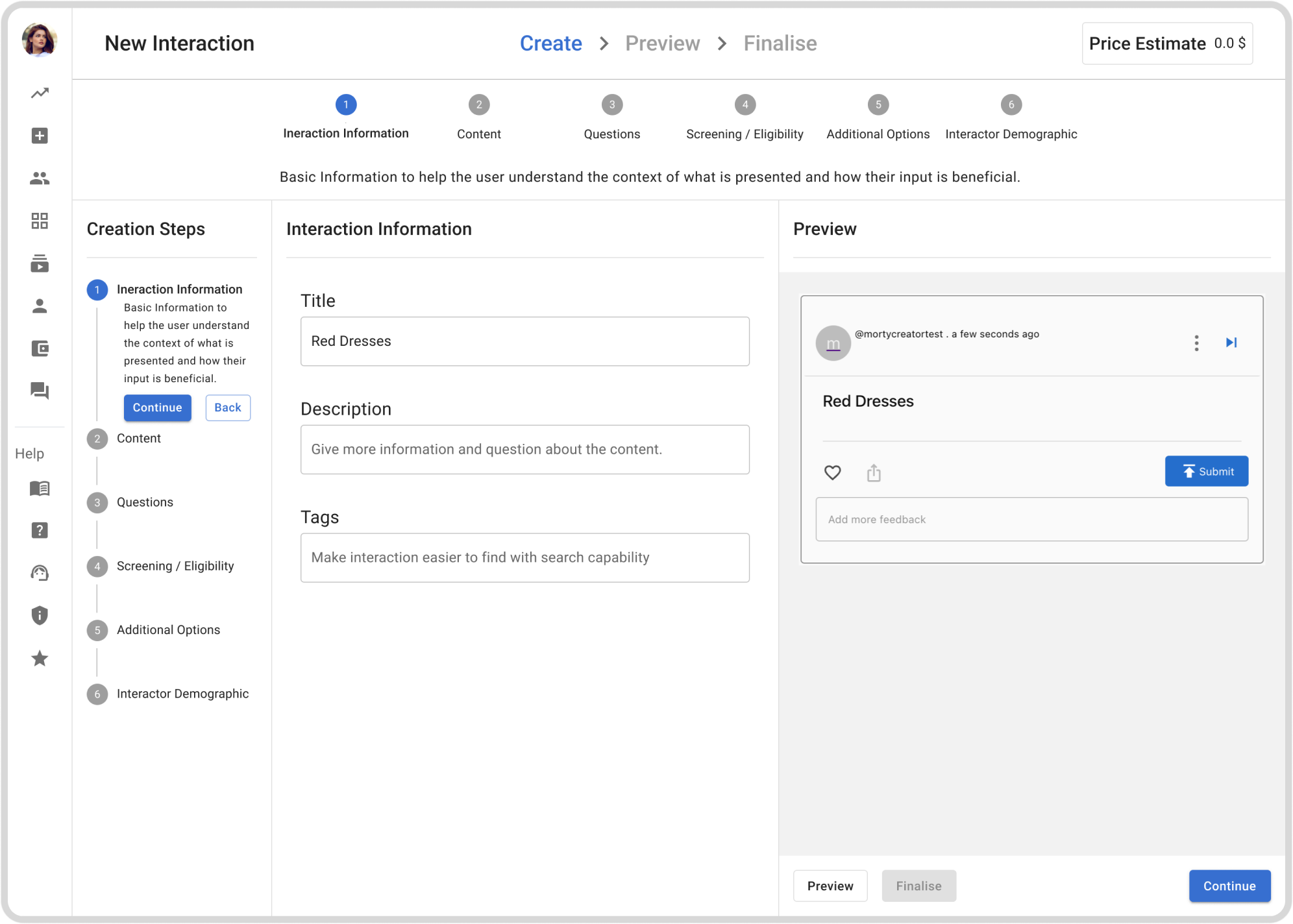
What changed and why
- Preview and pricing during editing. Creators could check the audience-facing result and estimated cost without leaving their work.
- Space for editing and preview. I moved the creation steps to the left, adjusted spacing and made the main sidebar expand on hover.
- Distinct question sections. I separated research questions from eligibility screening so creators could distinguish what they wanted to learn from who could participate.
Watch the redesigned creation flow · 42 sec
Follow the sidebar expansion, the preview and price estimate during editing, and the separate Questions and Eligibility sections.
View the design priorities and draft-saving proposal
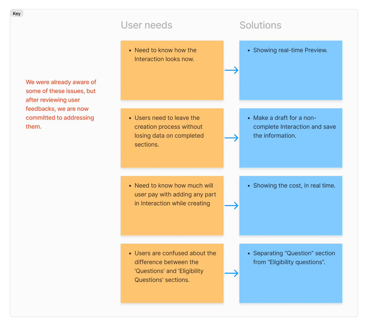
Proposed: draft saving. I proposed saving unfinished Interactions so creators could return without losing their work.
Testing revealed three usability problems
I chose a Figma prototype to avoid adding load to the live product, then conducted a usability test through Maze before development. I wanted to understand whether creators could follow the flow, manage questions and complete the setup.
We recruited through BetaTrends’ existing user network. Some participants completed the test independently; I supported and observed others remotely, combining those observations with Maze’s recorded results.
Watch a Maze task · 59 sec
Task instructions appear alongside the interactive prototype.
Watch the first Maze results · 31 sec
The report records task paths, duration and misclicks.
What the first test revealed
- Difficulty navigating between questions, editing them and adding another.
- Similar buttons made the next action unclear.
- Missing required information could be discovered only at Finalise.
Making questions easier to manage
I changed the question forms to an accordion so creators could open a question for editing and collapse it when reviewing the set. I also designed drag-to-reorder. Pieter initially deferred reordering; it was eventually released.
I adapted the accordion within our shared MUI-based design system and documented the component changes for developers.
Watch question management · 25 sec
Follow the accordion editing and question-reordering demonstration.
Making the next action clearer
I made Continue the clear next action by regrouping controls in the Preview area and reducing Back’s emphasis. I removed the separate Finalise button; creators could still reach Finalise from the last step or the phase icon above.
Watch action refinements · 36 sec
Compare action placement, Finalise access and the Continue/Back treatments.
Showing unfinished work earlier
I added distinct icons, labels and colours for incomplete steps. I specified that a step should show as complete only when required information was provided, and that Finalise should remain unavailable while required information was missing.
Watch completion feedback · 24 sec
Watch the misleading tick, late validation and revised incomplete-step indicator.
I updated the prototype and conducted a second Maze round to evaluate the refinements.
Retesting showed fewer misclicks
After refining question management, actions and completion feedback, I tested the updated prototype again. The second Maze report recorded fewer misclicks and shorter average task times across the same seven task areas.
| Task area | Measure | First round | Second round |
|---|---|---|---|
| Questions and Eligibility Questions | Misclick rate | 77% | 21.1% |
| Preview and Finalise | Misclick rate | 56.8% | 2.3% |
| Preview and Finalise | Average task time | 121.7 sec | 15.7 sec |
The first Maze round had 10 participants and the second had 22. Samples and test conditions differed, so these comparisons do not isolate the effect of the design changes.
Watch the second Maze results · 41 sec
Look at Questions and Eligibility Questions, then Preview and Finalise—the two task areas compared above.
Creation-time usability evaluation
47% less time to create an Interaction
- Before the redesign
- 21 min 52 sec
- After the redesign
- 11 min 38 sec
This separate usability evaluation drew on Hotjar and Maze evidence; the 47% is not calculated from the Maze task comparisons above.
From retesting to release
After the second Maze round, I handed the final Figma screens and end-to-end prototype to developers, including question editing, incomplete-step states and the rules for entering Finalise. The redesigns were released.
After release, we continued reviewing Hotjar recordings and in-person feedback.
What I learned
Simplifying a complex workflow does not always mean removing steps.
Visible progress, timely feedback and an in-context preview mattered alongside the sequence. I learned the value of testing early and revisiting a direction when evidence challenged it.