Arium · UX/UI design
Making Tournaments Easier to Join and Follow
Redesigning Arium’s tournament experience across desktop and mobile, contributing to a platform reporting a 35% monthly return rate.
Arium was a cloud-gaming platform where people could play across devices, join tournaments and watch streams. Players needed to know whether they could join, when their next match started and what to do next. Viewers needed to follow the competition without entering it.
I proposed and facilitated journey mapping, created the initial information architecture, and designed responsive search and participation states. I also prepared developer documentation covering components, interface elements, interactions and states. We developed the overall interface together as a three-designer team.
Watch Arium’s product introduction · 92 seconds
- My role
- UX/UI Designer
- Team
- Three designers, with product and engineering
- Scope
- Tournament journeys across desktop and mobile
- Delivery
- Implemented and released.
The experience had to stay clear as the competition changed
We were rebuilding much of the tournament feature and designing many features from scratch. It needed to support players and viewers from registration through final results.
Eligibility, available places and deadlines determined whether someone could join. After joining, match progress changed what they needed to see and do. Our challenge was to organise the information and make the next action clear at each stage.
I created a checklist to choose UX methods
To work within tight deadlines, I created a UX-method checklist. For each feature, we selected the methods we needed and estimated the time together. This helped us plan the work and move faster.
Players and viewers needed different information
I proposed journey mapping to understand what different users needed throughout a competition. I facilitated a workshop with the designers and Product Manager. We created a separate journey for each of four user types. I created one of the maps, and we reviewed them together.
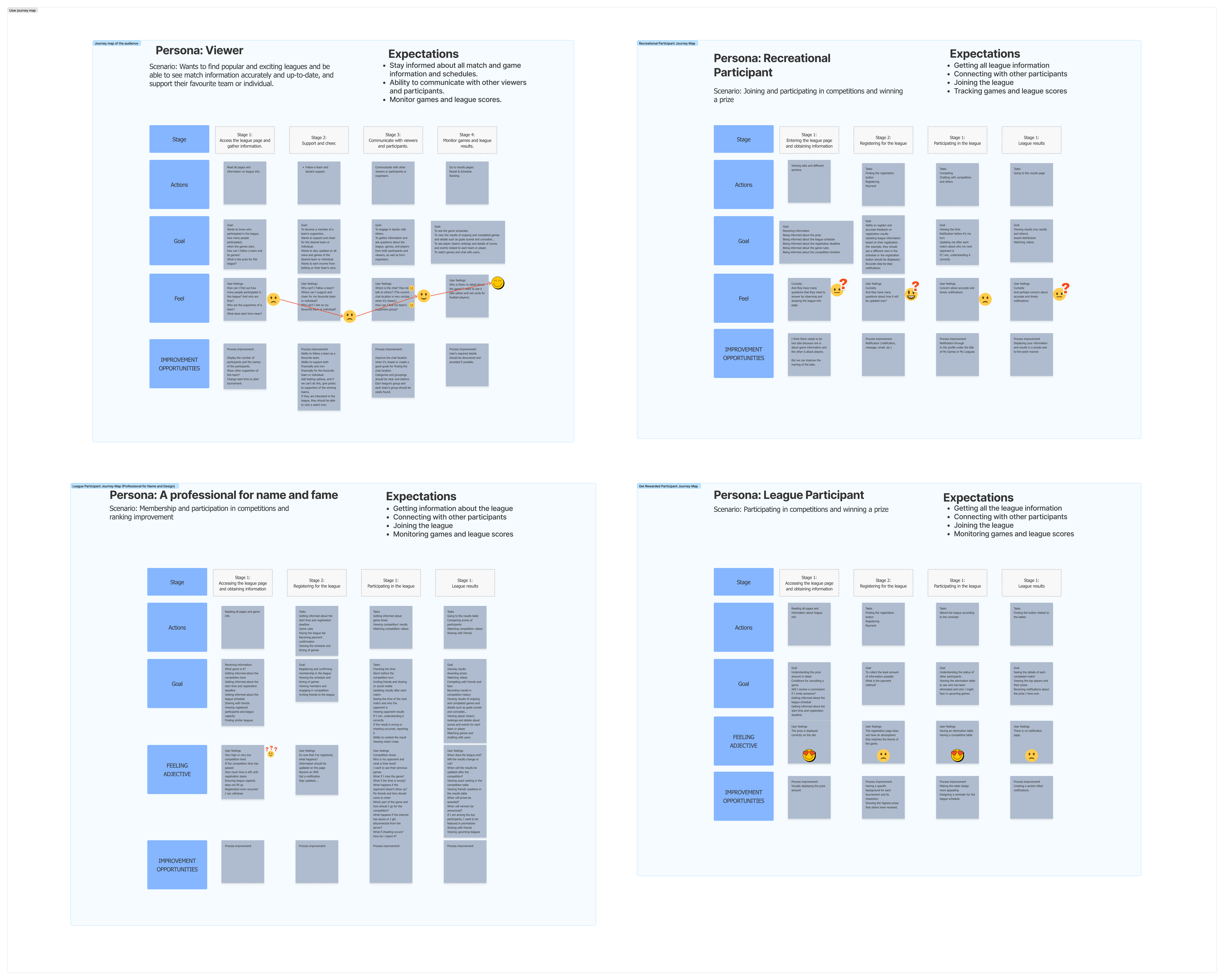
Four user groups, different needs
Viewers
Schedules, results, player details and streams.
Players seeking enjoyment
Joining, match timing and progress.
Players seeking recognition
Opponents, rankings and position.
Players seeking rewards
Prizes, eligibility and entry requirements.
I analysed the competing platforms assigned to me as part of our team comparison. Dense text and weak grouping made important details difficult to scan. Clear schedules, rules and rankings offered useful references.
Viewer needs and early ideas
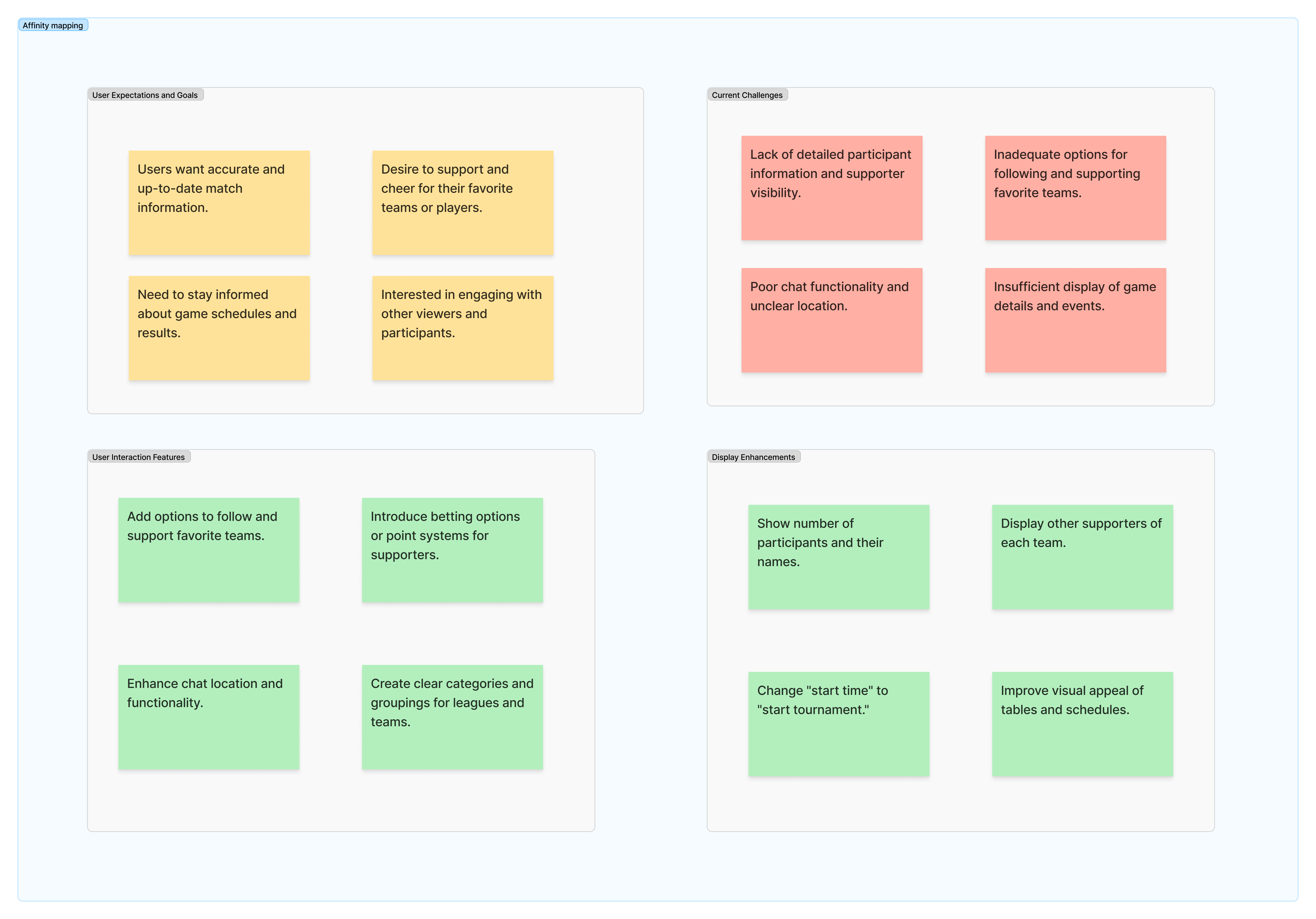
We used affinity mapping to group related needs, challenges and ideas from the discovery work. Across the four journeys, we distinguished the information needed to assess a competition from the information needed while playing or watching.
Viewers needed up-to-date schedules and results, clearer participant information, and ways to follow their favourite players or teams.
Research evidence: competitor comparisons


I separated entry information from match progress
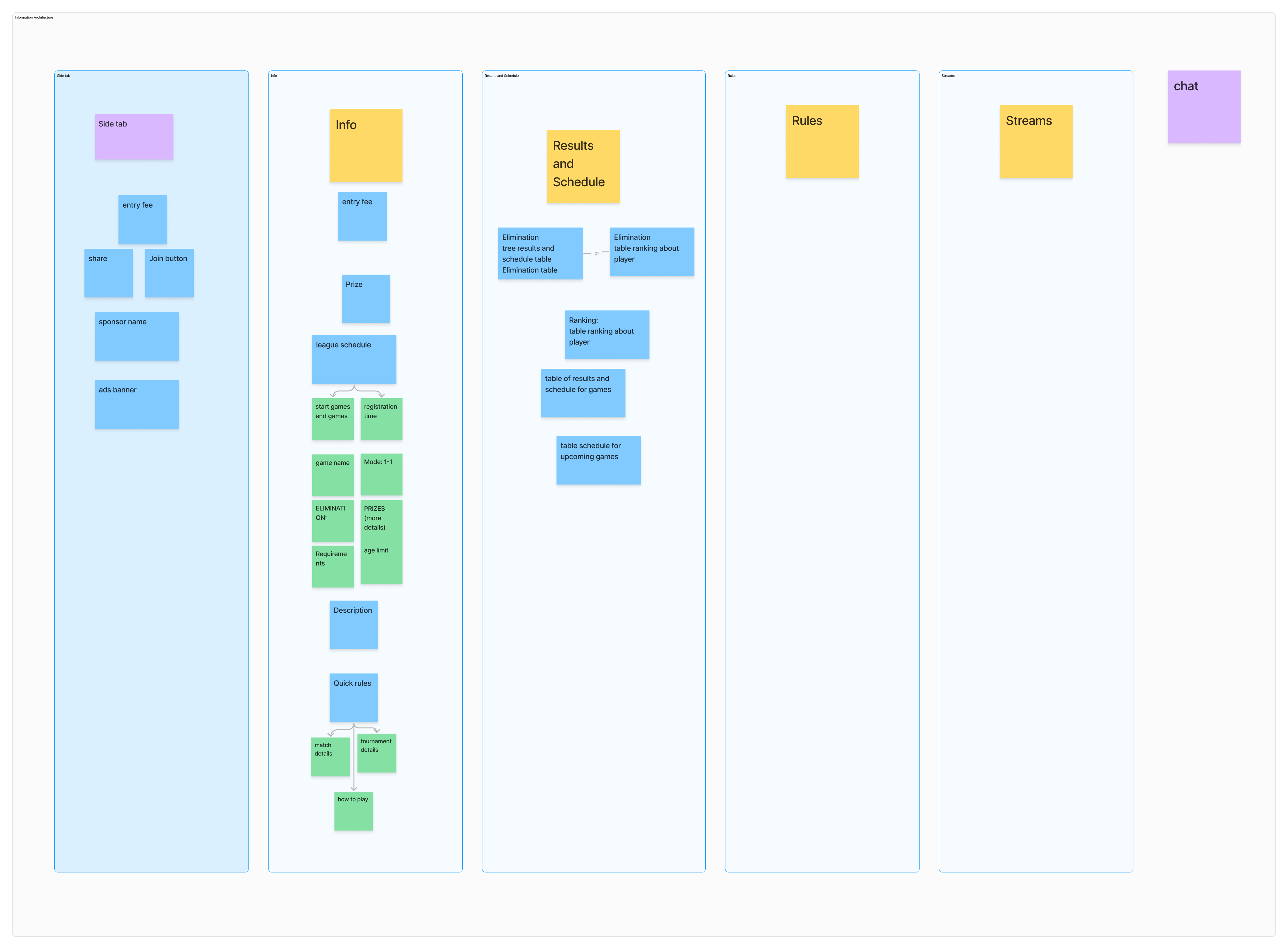
Using those different needs as a starting point, I proposed organising the content with sticky notes and created the initial information architecture in FigJam. We reviewed the groups together before developing sketches and interface designs.
Players deciding whether to join needed timing, eligibility, rules and prizes. People already participating—or watching—needed schedules, results, rankings and streams. Separating these tasks gave us a structure to build on.
30 seconds
The content groups became page layouts
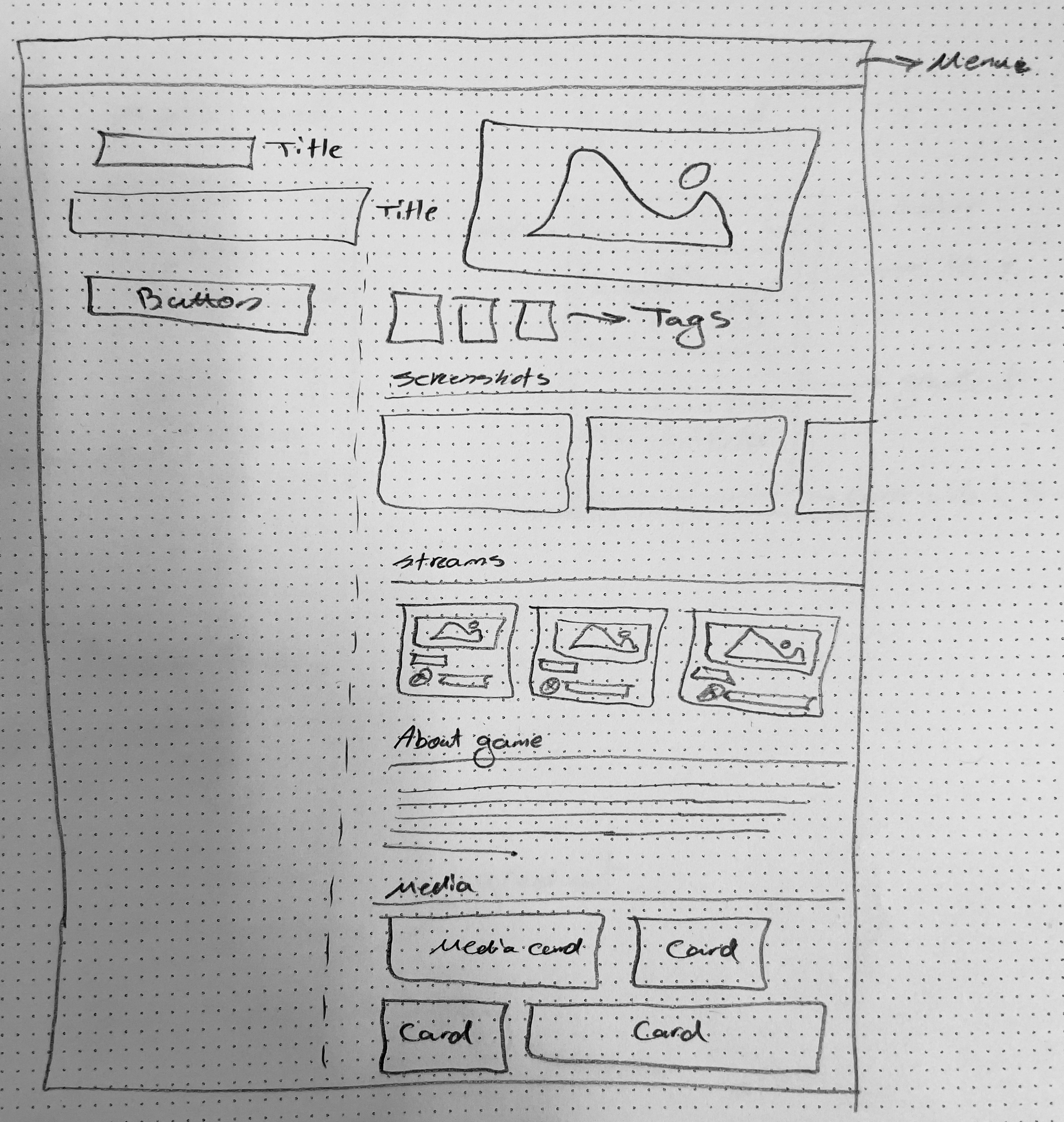
Paper sketches explored how to arrange the content on a tournament page. Low-fidelity wireframes developed layouts for information, match progress, rankings, rules and streams before detailed interface design.
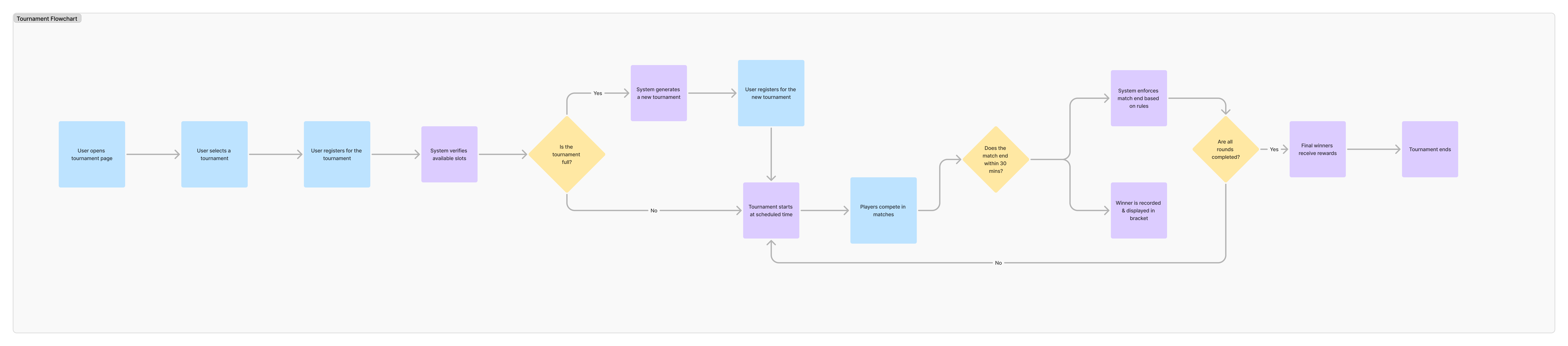
The screens also needed to follow competition rules
I helped the Product Manager refine registration and match flows. These connected the interface to capacity checks, match timing and progression through the competition.
Supporting design exploration: wireframes and information architecture
14 seconds
Testing showed where the designs needed to change
Stakeholder review established requirements for different game formats, mobile participation and exceptions such as disconnections.
I created interactive Figma prototypes, and we asked gamer colleagues to complete specific tasks. Observing their actions and gathering feedback revealed unclear information and interactions. The four examples below show the findings and design responses.
Rules and rewards were hard to find
Users struggled to find key tournament details, making rules and rewards difficult to understand when deciding whether to join.
We revised the Info view to bring timing, prizes and registration details together, with rewards broken down by finishing position.
13 seconds · silent demonstration
Players needed to know whether to join, wait or start
Users found actions and supporting information unclear after joining or when a tournament’s status changed.
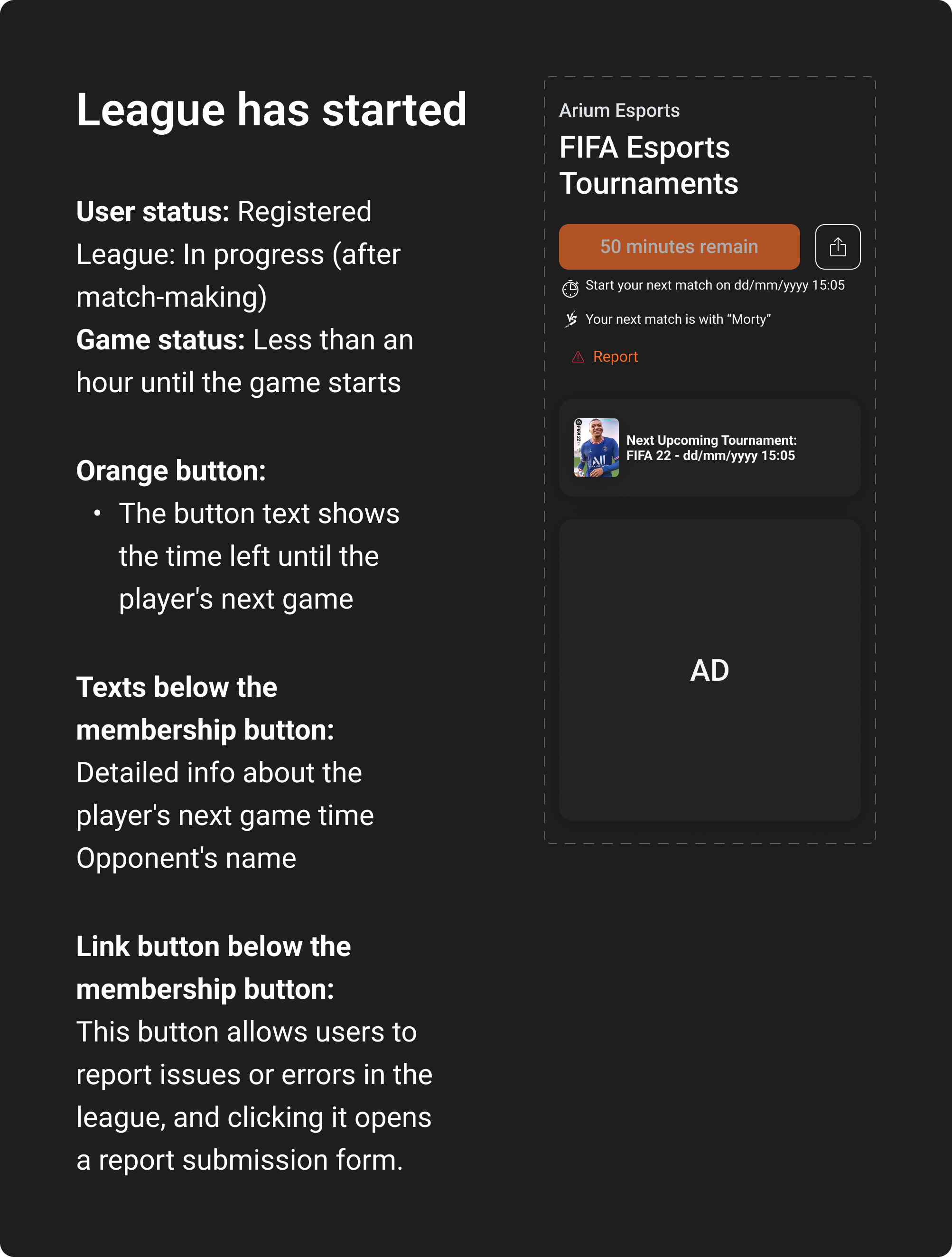
I designed participation states and checked them against the requirements. Buttons and messages reflected both tournament stage and whether the player had joined.
Closed registration prevented new entries, but registered players still needed their next action. Opponent details and countdowns showed when their next match could start.
24 seconds · silent demonstration
Match summaries and streams belonged beside results
Users wanted easier access to match summaries and live streams from Results and Schedule.
We added expandable summaries and stream access within each match row, so users could open those details alongside the score.
9 seconds · silent demonstration
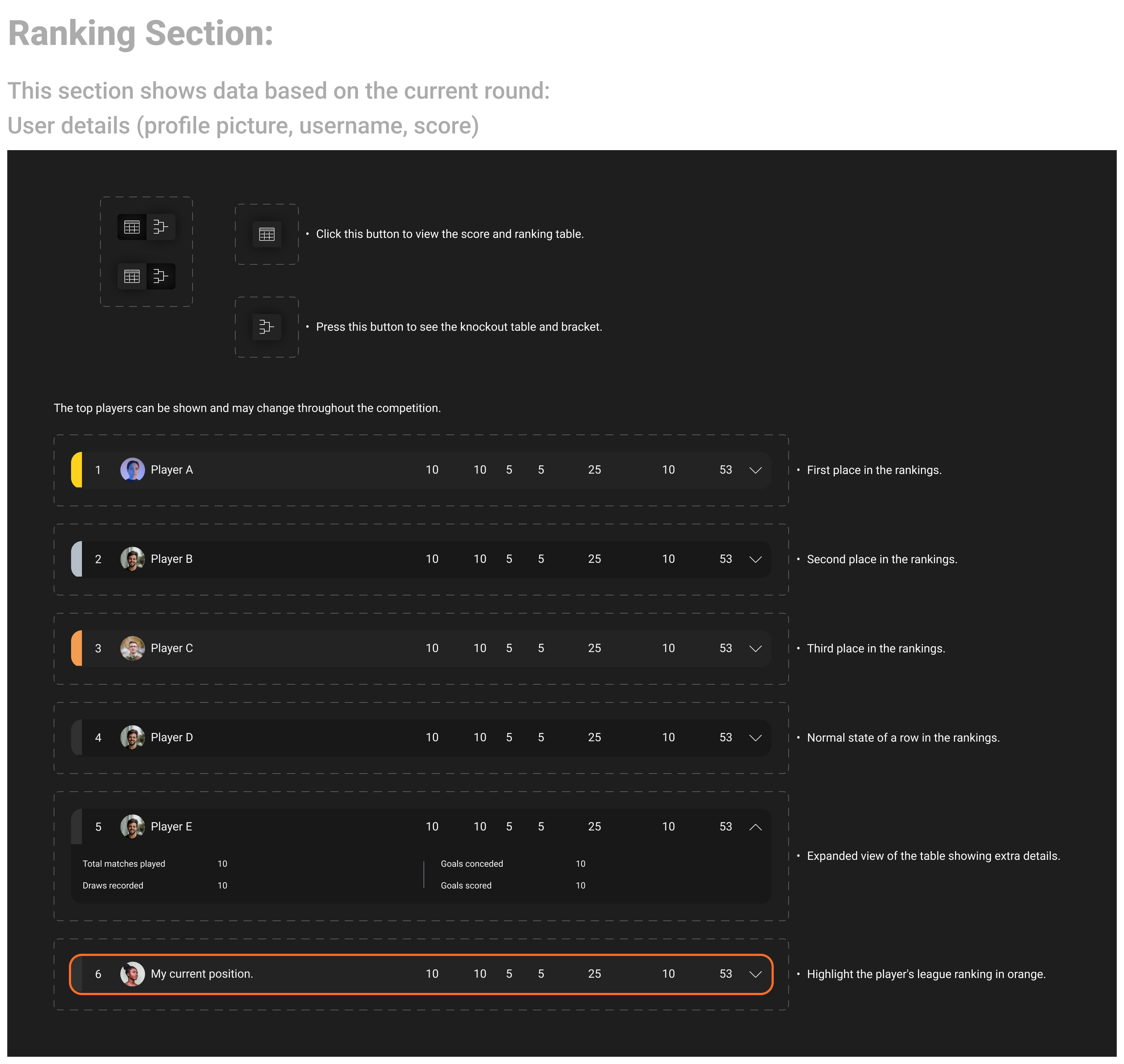
Different formats needed different ranking views
Testing revealed unclear rankings across competition formats and a need for more player information.
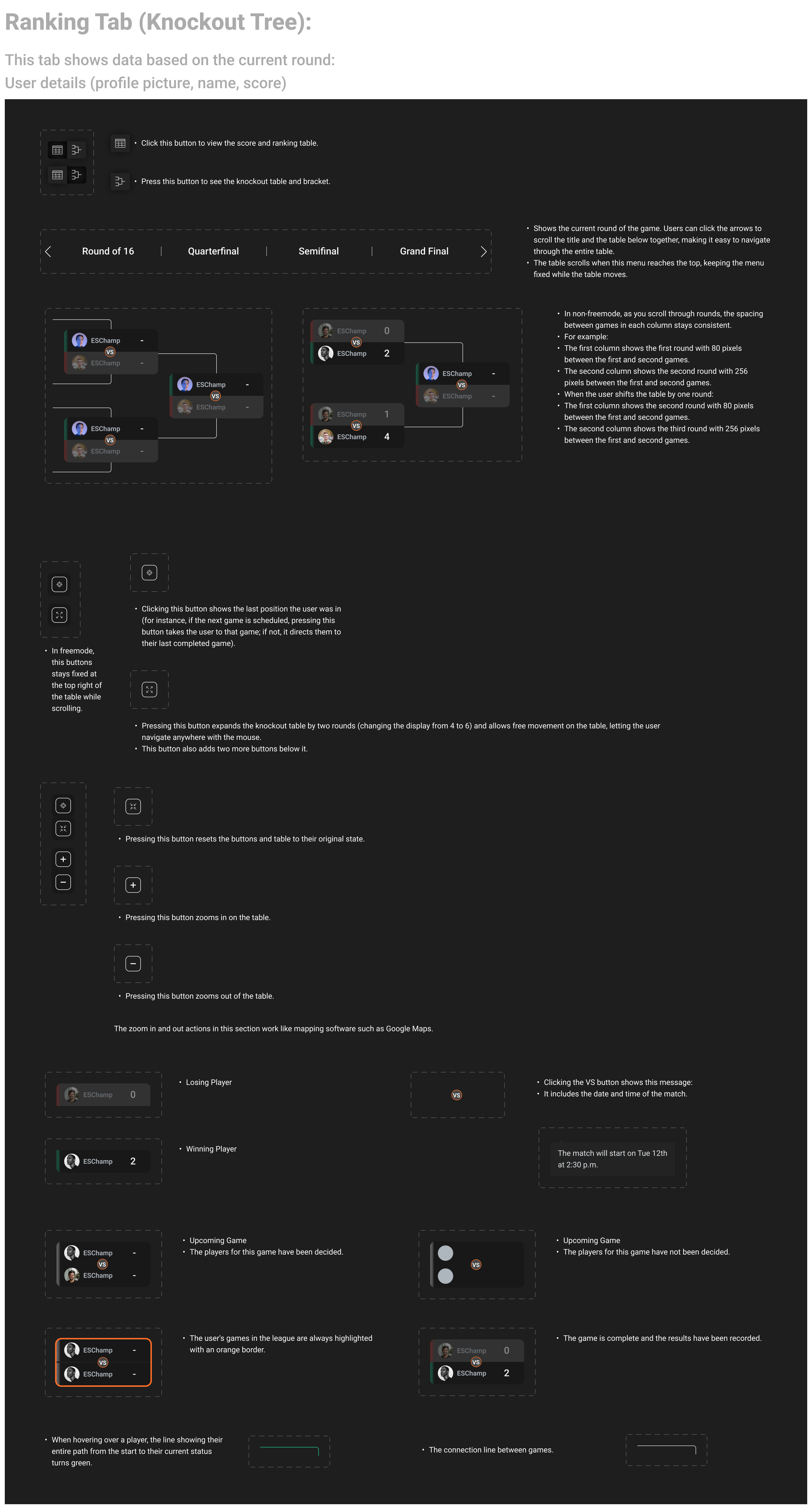
We revised the views: tables showed standings, brackets showed progression, and expandable rows provided player details. A highlight marked the current player’s position.
On mobile, players could navigate rounds and return to their latest match.
19 seconds · silent demonstration
We repeated prototyping, testing and refinement across the feature, then gathered stakeholder feedback and made final adjustments before developer handoff.
I prepared the designs for development
Handoff discussions often required repeated explanations of the designs. I proposed documenting components and features alongside the screens, and the team asked me to prepare the Figma documentation.
I brought together the designs, interactive prototypes and written explanations developers needed. The documentation covered components and individual interface elements, including their information, interactions and behaviour in different conditions.
Component details and controls
The ranking specification describes the information shown, the controls for switching views and the different row states. It gives developers a reference for both the component’s parts and how they work together.
Match states and countdown rules
For a registered player waiting for a match, I documented the conditions behind the countdown, match time and opponent information.
I checked the Product Manager’s user stories against the designs and tracked requirement changes. I also proposed an “update in handoff” step to keep the developer reference aligned with design changes.
I created and refined components in our shared Figma library. We held developer review sessions to discuss implementation questions.
The documentation also covered the cancellation, reporting and result-objection flows I designed.
Explore the full documentation walkthrough and specifications
98 seconds
The redesigned tournament experience went live
The designs I worked on were implemented and released, supporting players as they assessed competitions, joined and followed matches across desktop and mobile.
Arium’s reported results
What I learned
Organise around different needs. Players deciding whether to join needed different information from people already playing or watching. Mapping those journeys helped me establish the information architecture before refining the screens.
Define states alongside screens. Competition availability and individual participation status needed separate rules. I carried that distinction through the interface and developer documentation to explain what each player could do next.
Morty Akard · Arium