Betatrends · Full case study
Betatrends
Connecting a Fragmented Interaction Creation Flow
How behavioural evidence changed a step-based setup flow into a connected creator workspace.
I worked at Betatrends for around 1.5 years as a Product Designer. This case study covers an approximately six-month workstream on the creator-side New Interaction flow for desktop web. An initial MUI redesign improved consistency, but post-launch Hotjar recordings showed that creators still searched for actions, struggled with question lists and discovered incomplete work too late.
Overview
Project metadata
Role
Product Designer
Company context
Around 1.5 years at Betatrends
Workstream
Approximately six months
Team
Product owner, junior designer and approximately 2–3 developers
Scope
Creator-side New Interaction flow on desktop web
Reported outcomes
Completion time
21:52 → 11:38
Approximately 47% reduction in reported completion time
Reported Hotjar average; detailed methodology was not preserved.
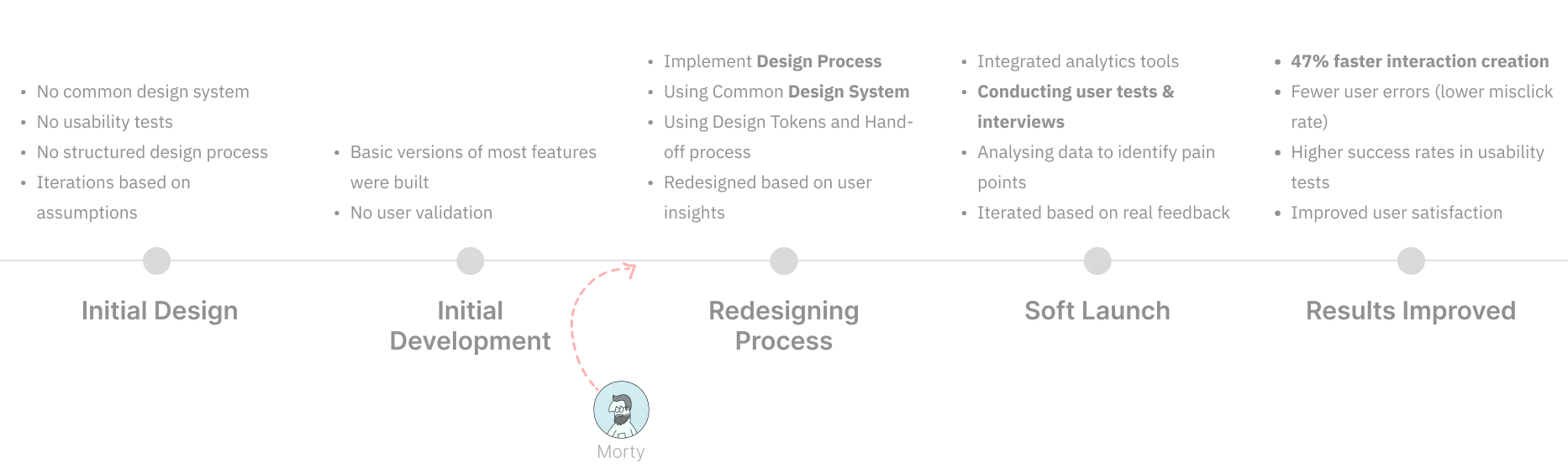
The product and the core task
Betatrends was a market-research platform. Creators published research activities called Interactions; interactors responded to them; Betatrends organised those responses into research insight.
An Interaction combined content, questions, eligibility requirements and audience options. Before publishing, creators also needed to preview it, understand its price context and resolve incomplete sections. This made Interaction creation a core MVP workflow.
The starting challenge
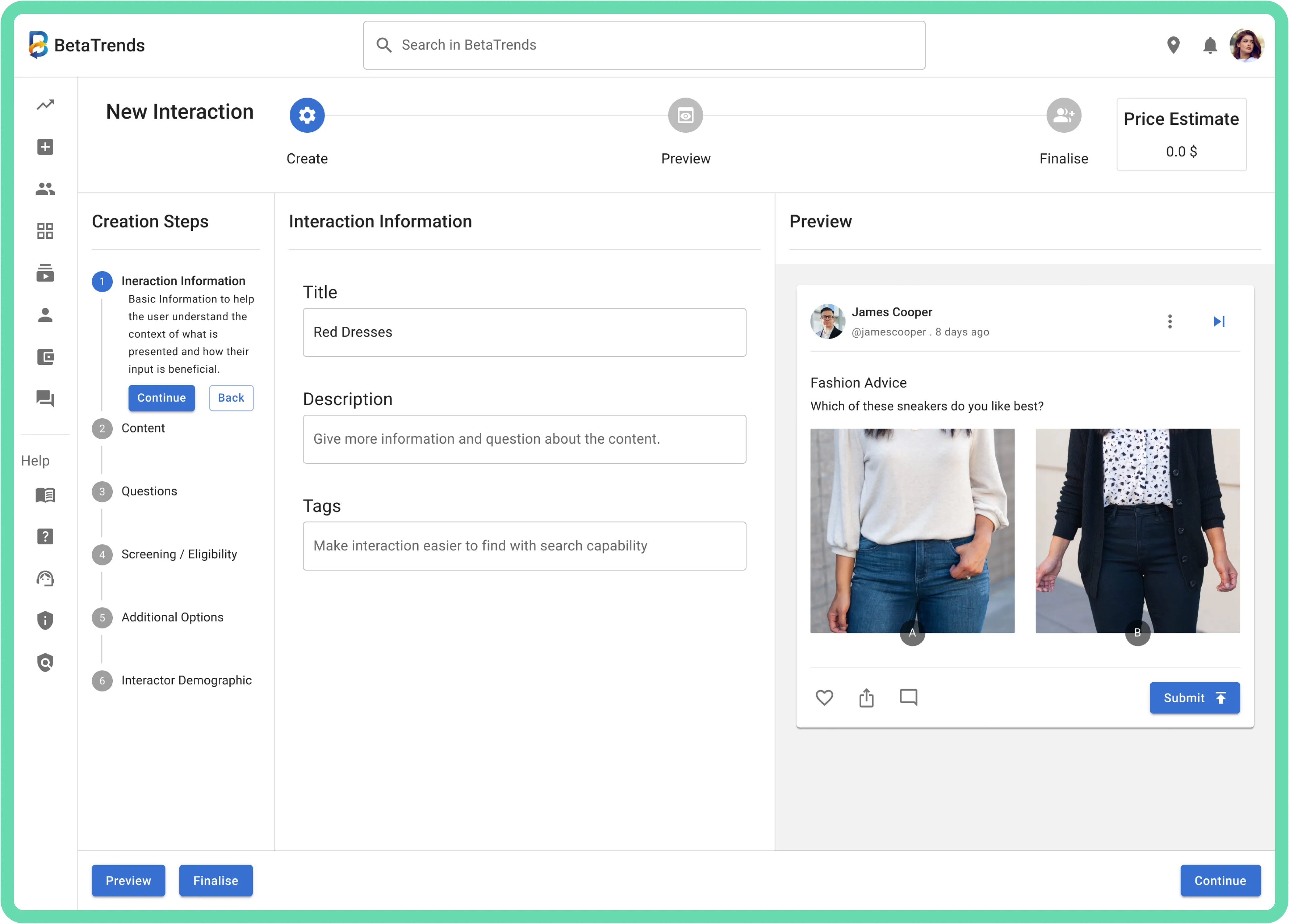
Creating an Interaction meant coordinating content, questions, eligibility, audience settings, preview, price and finalisation.
The design objective was to make this complex flow easier to understand and complete while keeping it feasible for a small team working with MUI.
My contribution
1. Synthesised behaviour into priorities. I suggested Hotjar, reviewed sessions, captured recurring observations and grouped them into product/design themes with the product owner.
2. Designed a connected interaction model. I created and presented three interface directions, then prototyped the direction selected by the team.
3. Tested and focused the refinements. I contributed most of the Maze planning and setup, reviewed the evidence and translated the remaining friction into focused interface changes.
I also contributed to flow mapping, MUI-based interface design, customised component states, handoff details and implementation review. Product prioritisation, MVP scope, final-direction selection, technical trade-offs and implementation decisions were collaborative. Developers implemented the product.
First direction
A consistent structure built from assumptions
Creating a consistent, buildable baseline
The team needed a consistent, buildable foundation quickly. I used a lightweight planning checklist to focus the workstream, then mapped the creator journey from available information and assumptions. These were planning tools rather than validated research.
The checklist supported scoping and decision-making; it was not evidence about users. We revised the task flow so the major stages were explicit and easier to discuss.
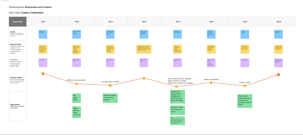
Journey mapping from available information and assumptions — a planning artefact, not validated research.
UX checklist planning
First redesign
Sketch to design
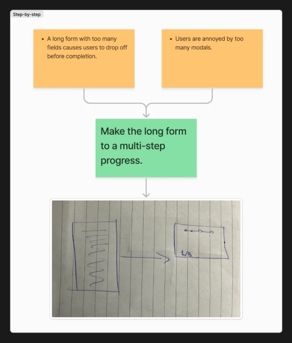
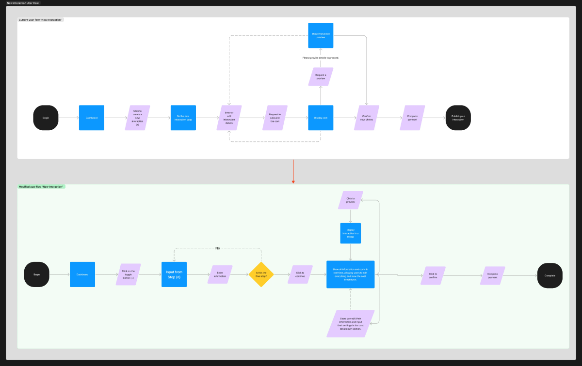
Revised task flow making major stages explicit for discussion and delivery.
Using MUI as a shared foundation
MUI provided consistency and a feasible foundation for a small team, but it also limited some custom interaction choices. Soft launch then made behavioural friction visible.
Hotjar changed the brief
Monitoring Hotjar report — New Interaction.
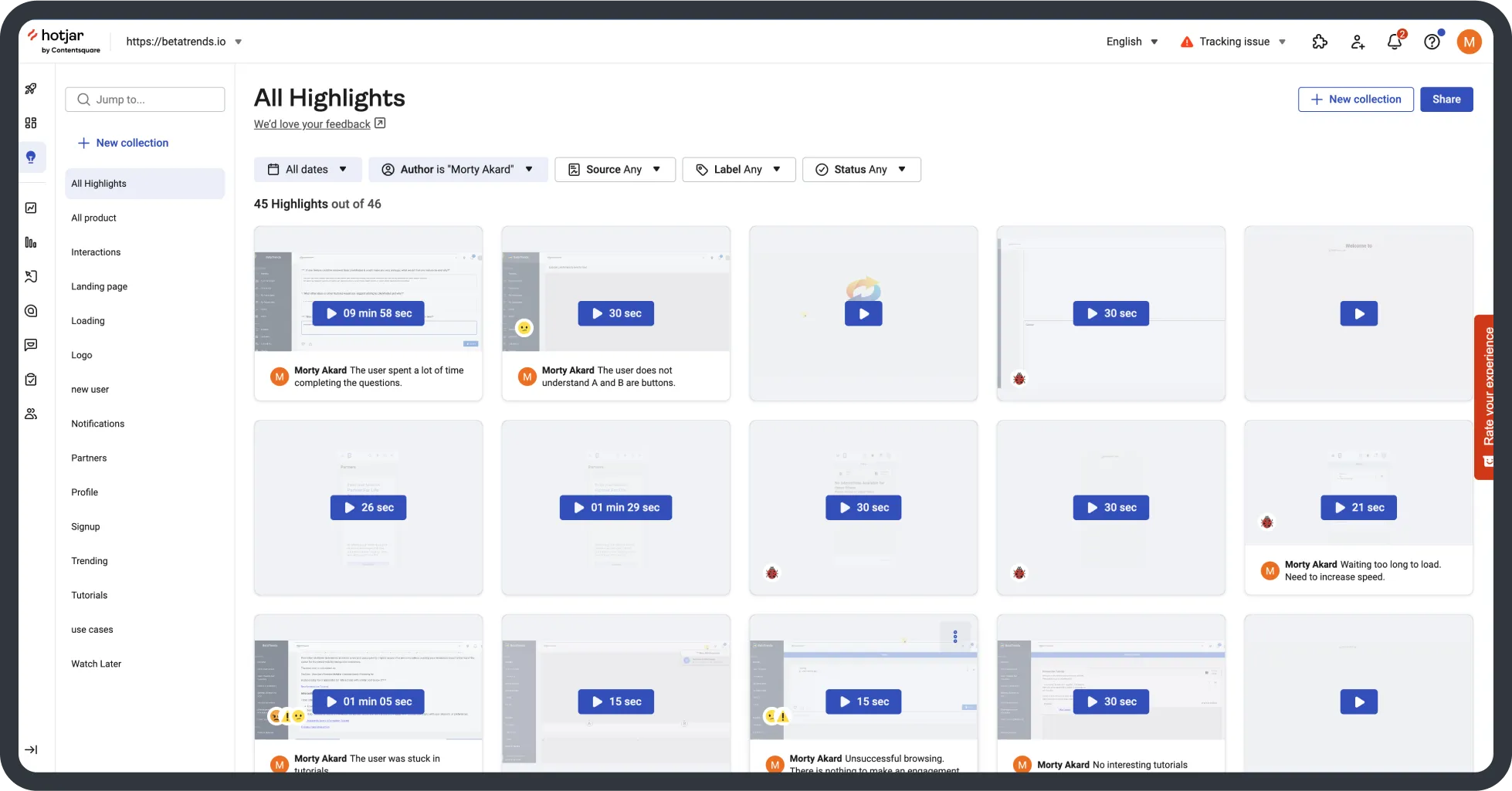
Hotjar overview — supporting behavioural evidence
After launch, I reviewed sessions across the product and created roughly 50 highlights and comments. I looked for repeated friction, grouped recurring observations into themes and discussed the resulting product/design priorities with the product owner.
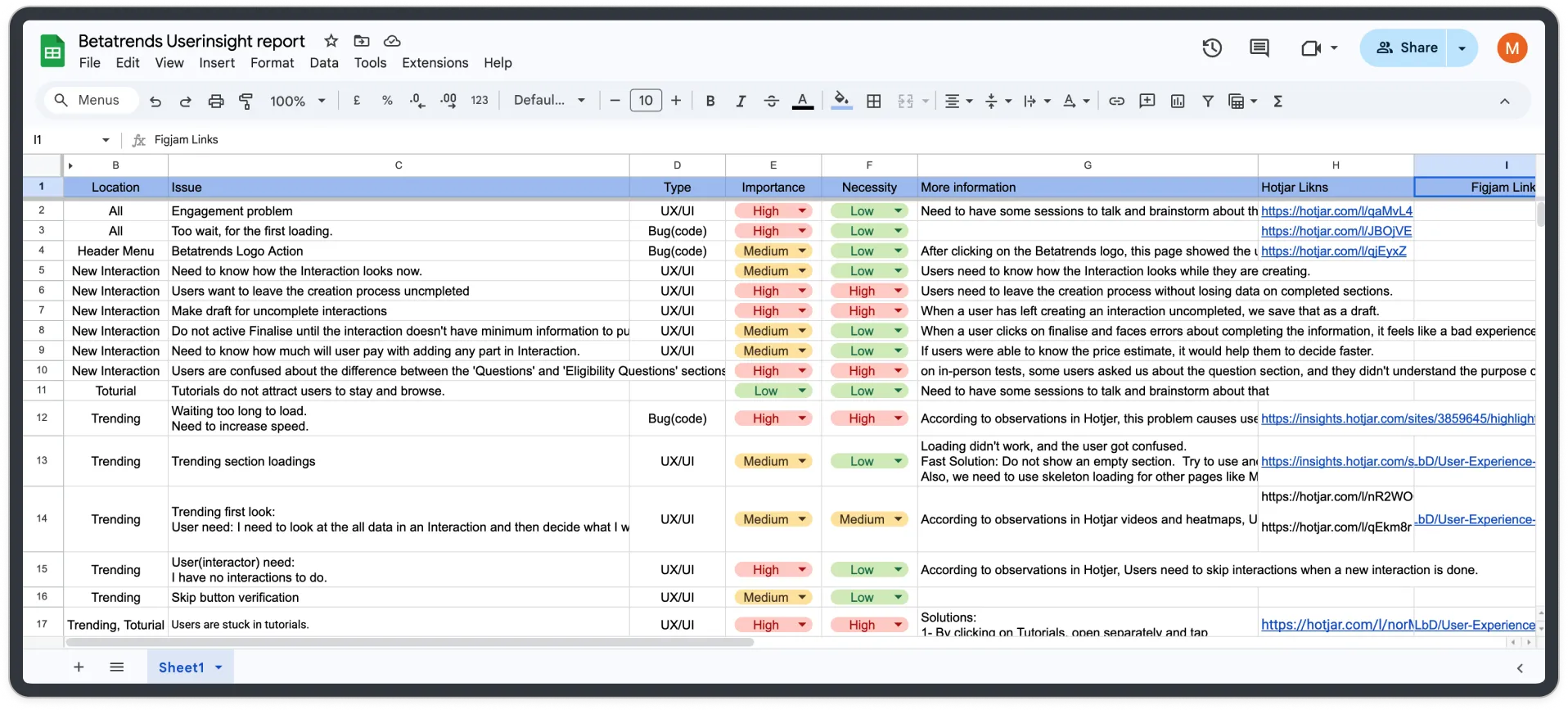
Hotjar observation-to-priority synthesis
For the New Interaction flow, three themes emerged: people searched for important actions; editing and organising questions caused repeated friction; and missing work became visible too late. These observations changed the brief. The next iteration needed to connect progress, editing, feedback and completion — not simply improve the styling of individual screens.
Exploring a connected workspace
Three directions for a more connected workspace
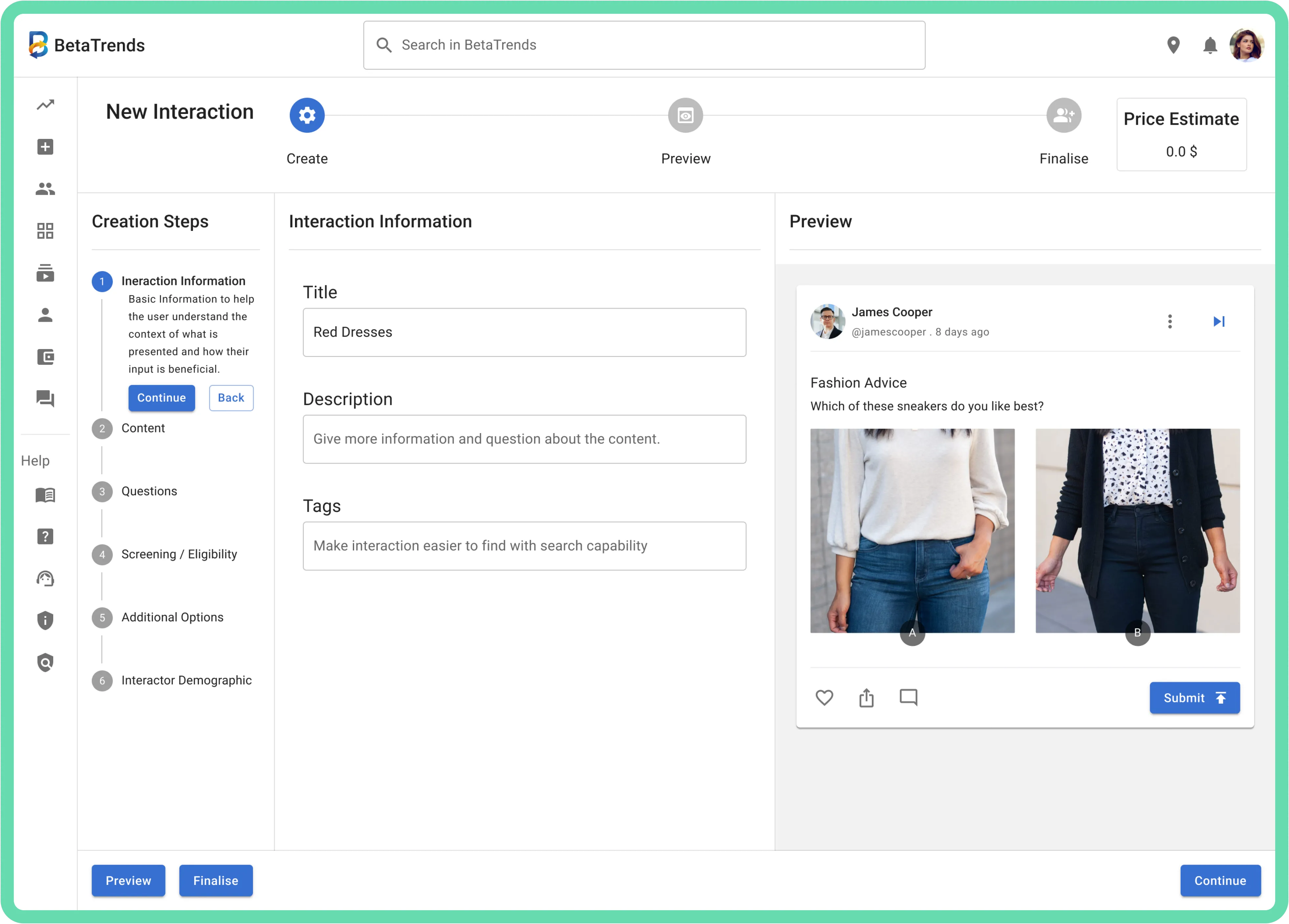
Direction A
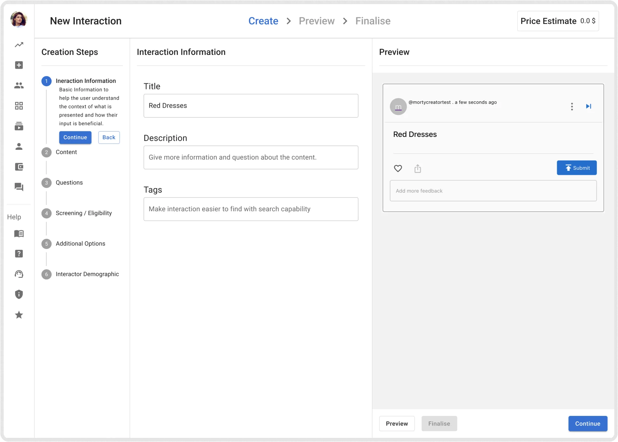
Direction B
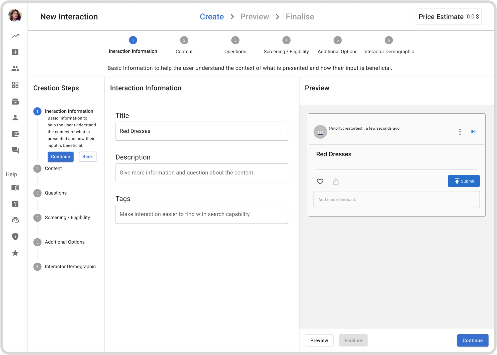
Direction C
Selected direction: persistent steps, editing, preview and price context in one workspace.
Selected connected workspace walkthrough.
Why the connected workspace was selected
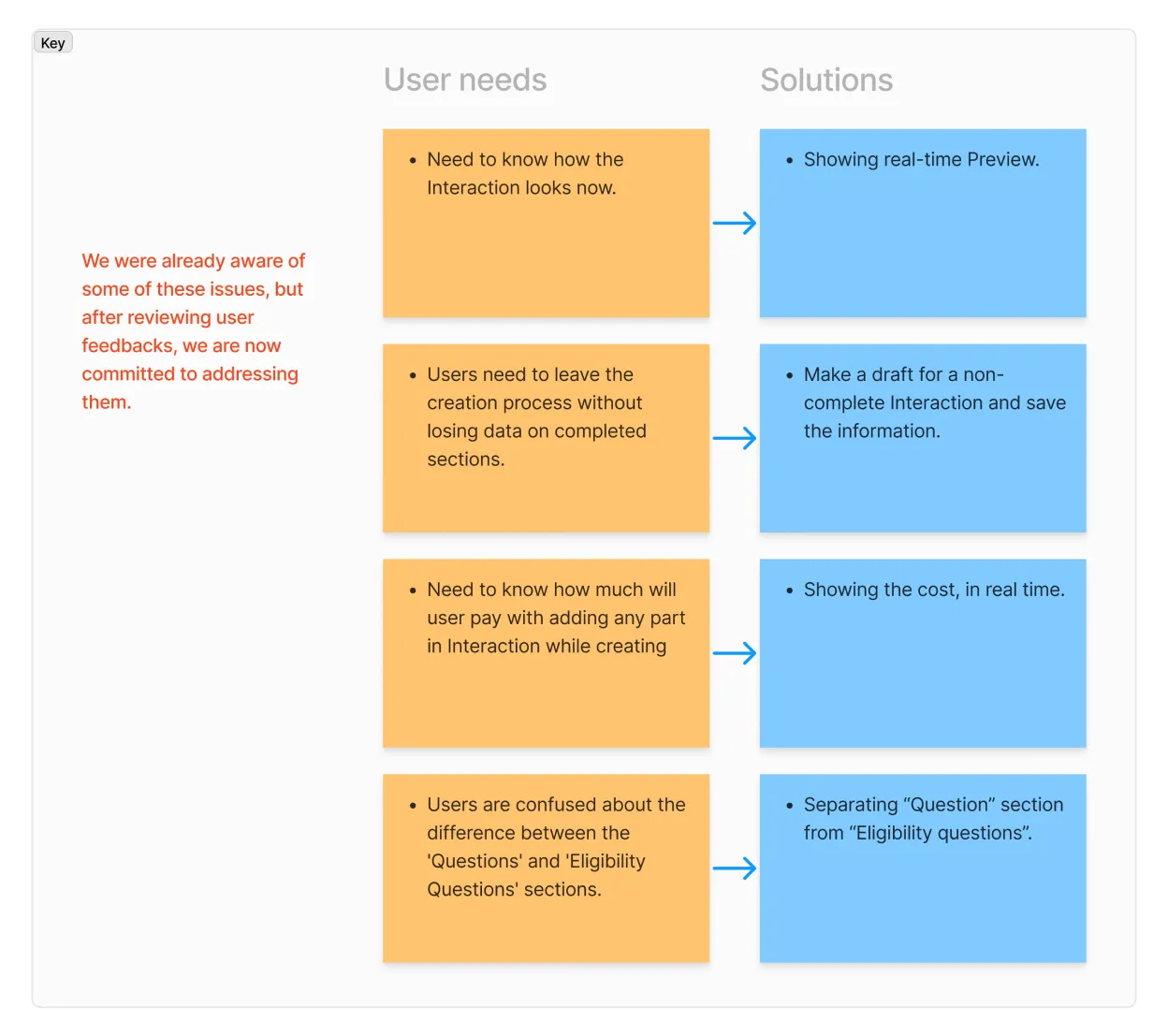
I explored three interface directions and presented them to the team. We compared orientation, switching between tasks, preview visibility and development feasibility. We selected the connected-workspace direction because it kept the creation steps visible, placed the editing task beside preview and price context, was designed to reduce switching and remained feasible within MUI and development constraints.
What changed in the workspace
1. Preview and price context stayed visible beside the work.
2. Creation steps became persistent orientation on the left.
3. The editing area and feedback were connected in one workspace.
4. Questions and Eligibility Questions became clearer, distinct sections.
5. The structure brought related parts of the task into one workspace.
Maze showed which problems remained
I set up most of the Maze test with input from the product owner. Participants worked through creating an Interaction, shared feedback during the task and, in some sessions, were observed over video call. I reviewed paths, heatmaps, misclicks, drop-off, success and comments as directional evidence rather than headline metrics.
Maze task walkthrough
Maze summary report
Usability breakdown
Second Maze report summary
Second attempt redesign
Three issues remained in the prototype:
1. Important actions were still difficult to locate, so the CTA hierarchy needed stronger emphasis.
2. Moving between, editing and adding questions remained difficult, so question types and list management needed refinement.
3. People could reach finalisation with unfinished sections, so incomplete work needed to appear earlier.
Hotjar changed the overall brief; Maze focused the final interaction refinements. These findings became the priorities for action hierarchy, question management and incomplete-step communication.
Final design direction
Five connected decisions
The workspace established two foundational decisions:
1. Keep preview and price close to the work. A live preview and price estimate remained visible while creators configured the Interaction.
2. Organise the workspace around persistent steps. Creation steps moved into a persistent left-side structure while editing and preview occupied the main workspace.
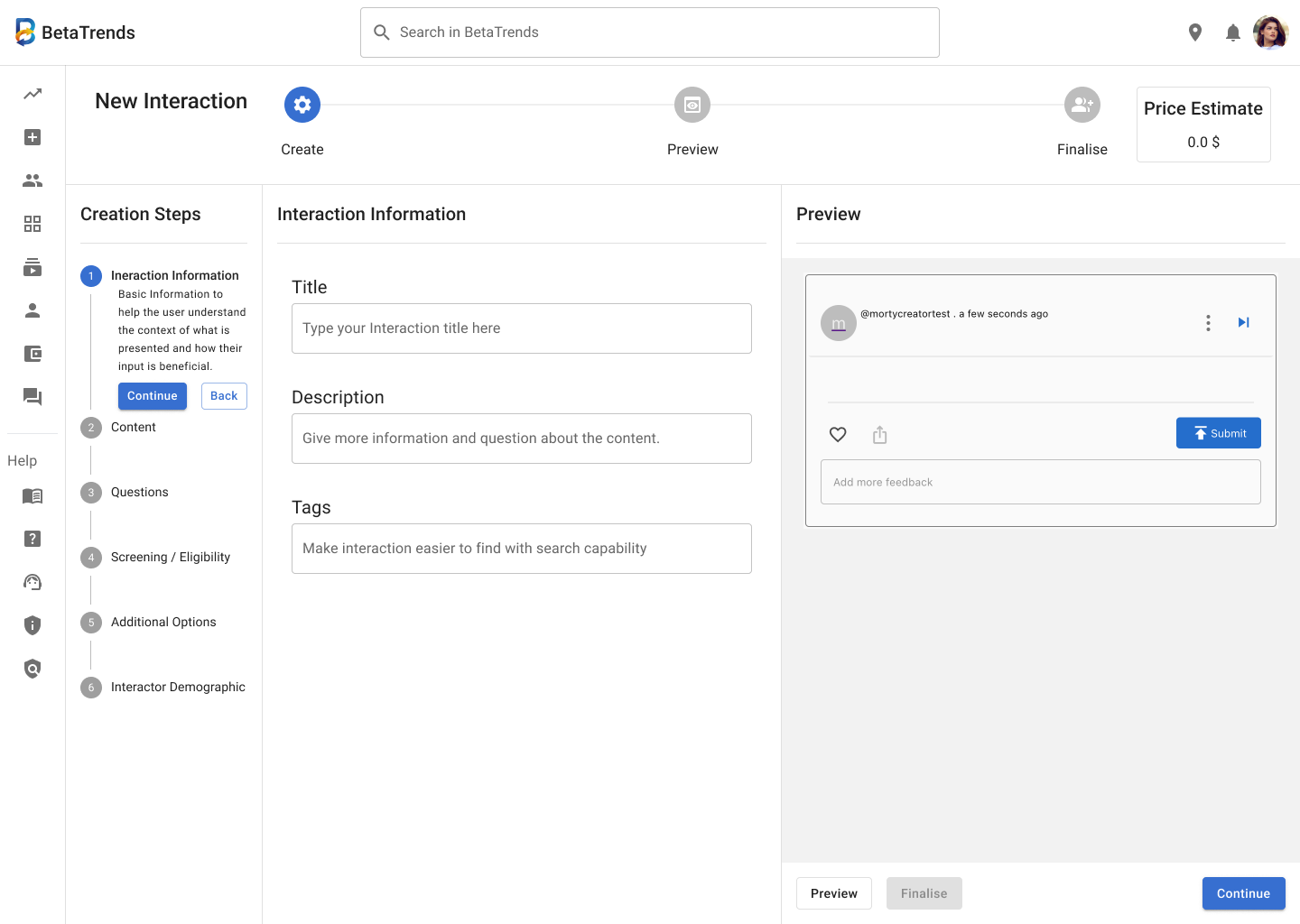
Preview and price context
Persistent steps
Make question management easier to scan
Questions and Eligibility Questions became distinct sections. Accordion states reduced how much content needed to remain open at once, while reordering supported a more flexible list structure.
Clarify the action hierarchy
Continue received stronger emphasis, Back became a secondary outlined action and controls moved closer to the working context. Finalisation was reserved for the appropriate point in the flow.
05
Surface incomplete work before finalisation
Distinct icons, text and colour identified incomplete steps while creators were still able to act on them. The intent was to reveal missing work before they reached the end of the flow.
Handoff and implementation review
I prepared annotations, specifications, component states and handoff notes where the design departed from standard MUI patterns. Developers handled implementation. I reviewed the implemented interface and reported design issues for refinement.
The final designs were used in the MVP. The portfolio images and walkthroughs remain labelled by their evidence status because they are design-source visuals, not presented as production screenshots.
Reported outcome
21:52 → 11:38
Approximately 47% reduction in reported completion time
Hotjar average completion showed time of 21:52 for the earlier flow and 11:38 for the later flow. Exact cohort, dates, exclusions and task boundaries were not preserved, so this remains a usability signal rather than causal proof.
Reflection and what I would validate next
This project changed how I think about complex creation flows. They are not simply sequences of fields; they must keep the outcome, progress, next action and unfinished work understandable throughout the task.
The hardest trade-off was simplifying that complexity within MUI and development constraints. MUI provided consistency and a feasible foundation, but it also limited some custom interaction choices.
Today, I would consider custom components where they materially improve the task without compromising build feasibility. I would also define the measurement plan before launch — one task definition, explicit success criteria, comparison windows and exclusions.
I would include keyboard and non-drag reordering, focus behaviour, non-colour status cues and responsive behaviour in that validation plan.